Posts
1639Following
139Followers
885I'm currently working on my second novel which is complete, but is in the edit stage. I wrote my first novel over 20 years ago but then didn't write much till now.
I post about #Coding, #Flutter, #Writing, #Movies and #TV. I'll also talk about #Technology, #Gadgets, #MachineLearning, #DeepLearning and a few other things as the fancy strikes ...
Lived in: 🇱🇰🇸🇦🇺🇸🇳🇿🇸🇬🇲🇾🇦🇪🇫🇷🇪🇸🇵🇹🇶🇦🇨🇦
Fahim Farook
f
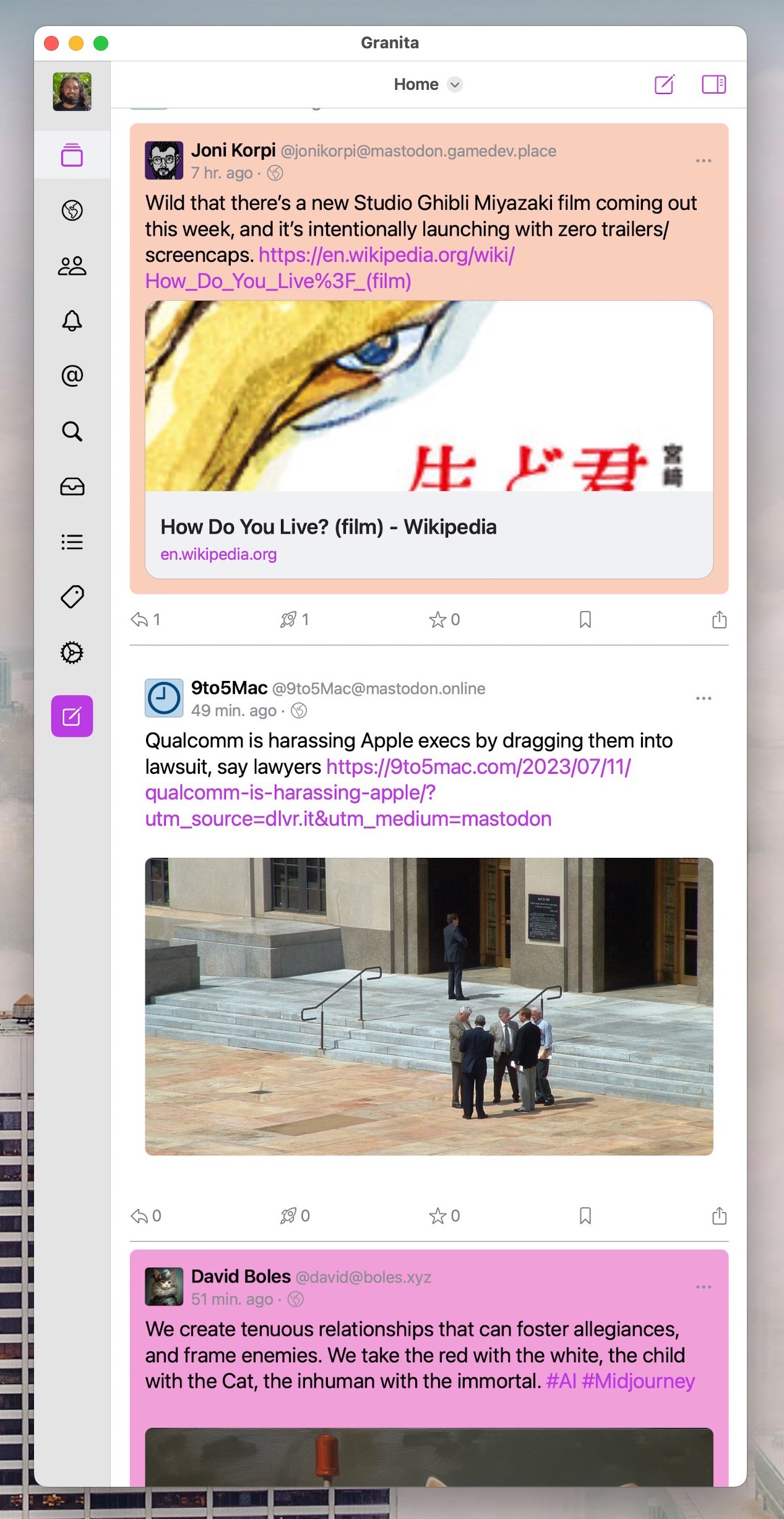
My custom Fedi client is coming along pretty nicely if I do say so myself ...
Works on macOS/iOS, supports Akkoma (and possibly Pleroma) fully, has custom colours for lists/hashtags, allows custom filtering and so on.
I’ve been working on it on and off for a while now but wasn’t really sure whether I wanted to continue using it or not. But the latest round of changes, and the ones I have in mind, kind of make me think that I’ll probably stick with it at least for a few more months 😛
#FediClient #macOS #iOS #Swift #SwiftUI
Fahim Farook
f
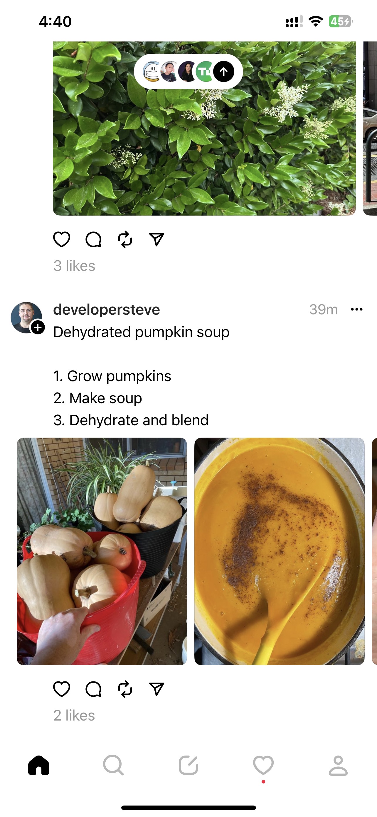
I thought Threads wasn't going to be available till at least 12 hours from now?
I’m already in. Here are the good points:
1. I’ve found people I know already since I follow them on Instagram.
2. I get to use my Instagram handle. Don’t have to fight over handles 😛
3. I immediately found somebody that I didn’t follow on Instagram, but was interested in following due to their YouTube videos. So discoverability (on a very quick scan) seems to be good.
4. I like their image gallery — the only app (I know of) which doesn’t ape Twitter and do that weird 1/2/3/4 grid. Threads just gives a scrolling gallery. Much nicer.
Haven’t used it enough to have any other impressions. But I do miss not being able to use it from my desktop since I’m not that heavy a mobile user ….
#Threads #FirstImpressions #TwitterReplacements
Fahim Farook
f
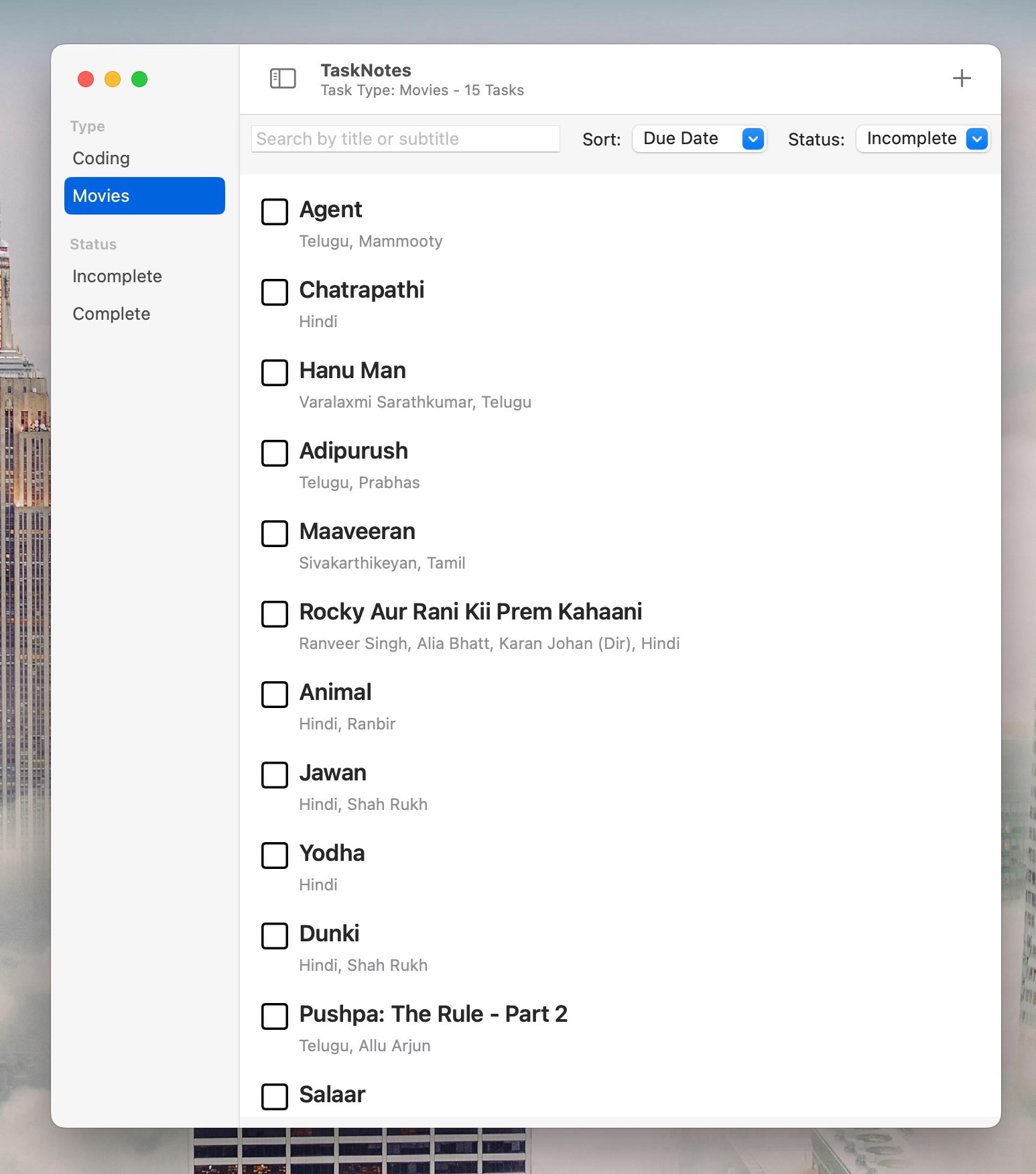
When I was younger, I would watch a movie trailer and remember all the details of the movie enough to remember to watch the movie months later when it came out. Now, if I can even remember some details from a trailer a week later, it is an achievement 😛
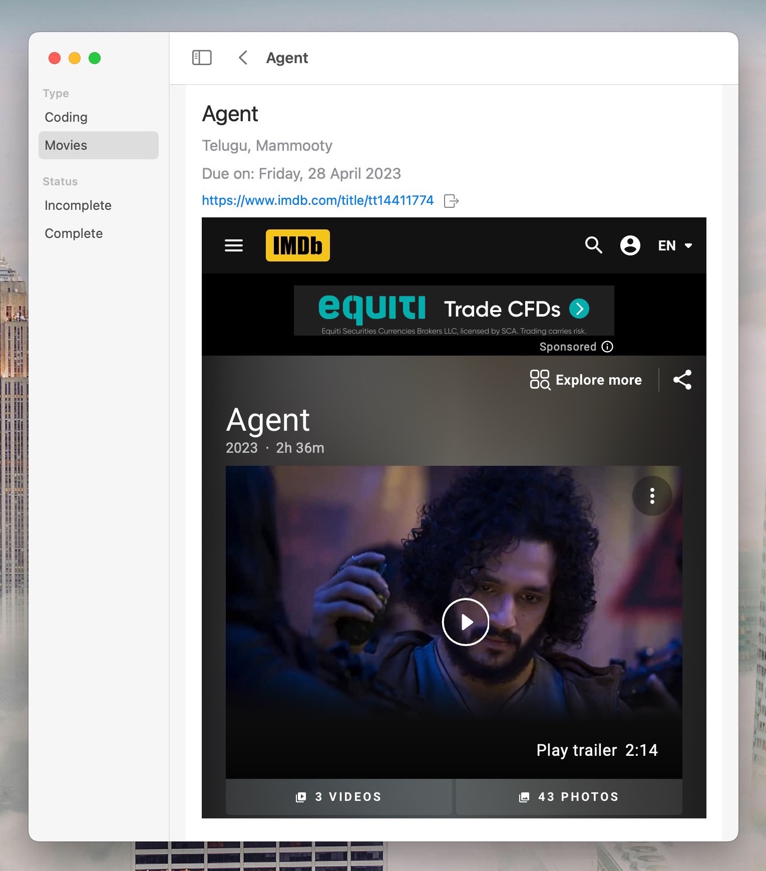
So, I decided to create a ToDo app which would remember stuff for me — movies, books, TV shows etc. and allow me to add a link to a site with details (such as IMDB) so that I can read about the movie in the app itself instead of going searching online.
This actually works pretty well for me in terms of remembering to catch up on a movie when it came out — especially after I added a release date to the list 🙂
But then, I realized that I can use the same app for coding tasks too. Sure, I guess it should have been obvious, but I already had a separate app for jotting down coding tasks …
Now, my app is morphing again as I look at ways to make the coding tasks side of things work with my regular flow.
Would it have been better to keep this as two separate apps?
But then I’d have to split development time between the two apps. This way, I can do all the dev work in one project.
However, the app might become “heavier” trying to accommodate two separate types of data/workflows …
Decisions, decisions 😛
#Coding #Swift #SwiftUI #iOS #macOS #Tasks #DesignDecisions
Fahim Farook
f
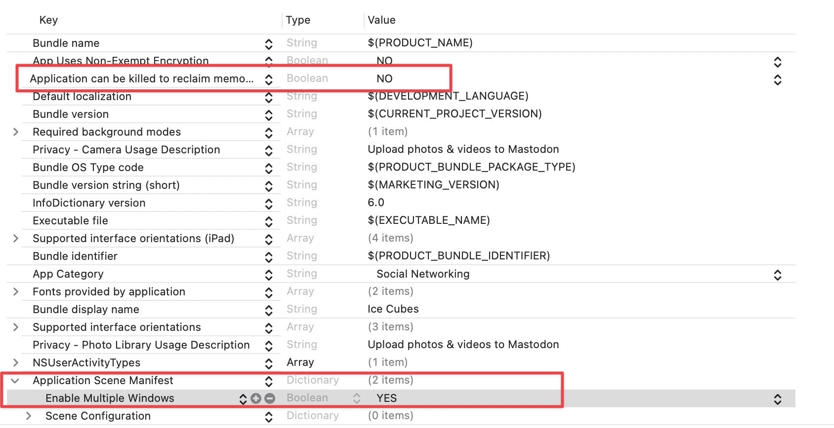
One thing that's often annoyed me about Mac Catalyst apps is that when you close the app (via the Close butotn on the top left of the window) the app terminates instead of minimising to the dock.
This behaviour can be changed with two Info.plist changes:
Application Scene Manifest > Enable Multiple Windows - YES
Application can be killed to reclaim memory - NO
#Xcode #Catalyst #Coding #Fixes
This behaviour can be changed with two Info.plist changes:
Application Scene Manifest > Enable Multiple Windows - YES
Application can be killed to reclaim memory - NO
#Xcode #Catalyst #Coding #Fixes
Fahim Farook
f
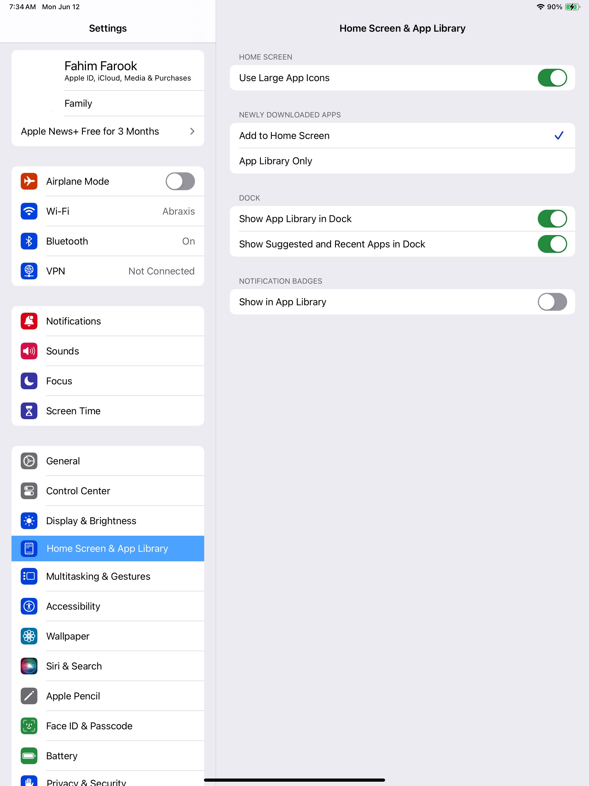
Installed iPadOS 17 on my iPad and thought that I discovered a new setting “Use Large App Icons” only to realize that it’s there on iOS 16 too 😛
For some reason, I never noticed this setting. But it’s rather useful when you’re as old as me and icons aren’t that easy to see. So, just mentioning in case there are others who didn’t know about this setting.
The Settings app section is different in iOS 16 — I believe it’s called “Home Screen & Multitasking” instead of “Home Screen & App Library” but the setting is the same.
#iPadOS17 #Apple #iPadOSBeta #LargeIcons
Screenshot of the “Home Screen …
Fahim Farook
f
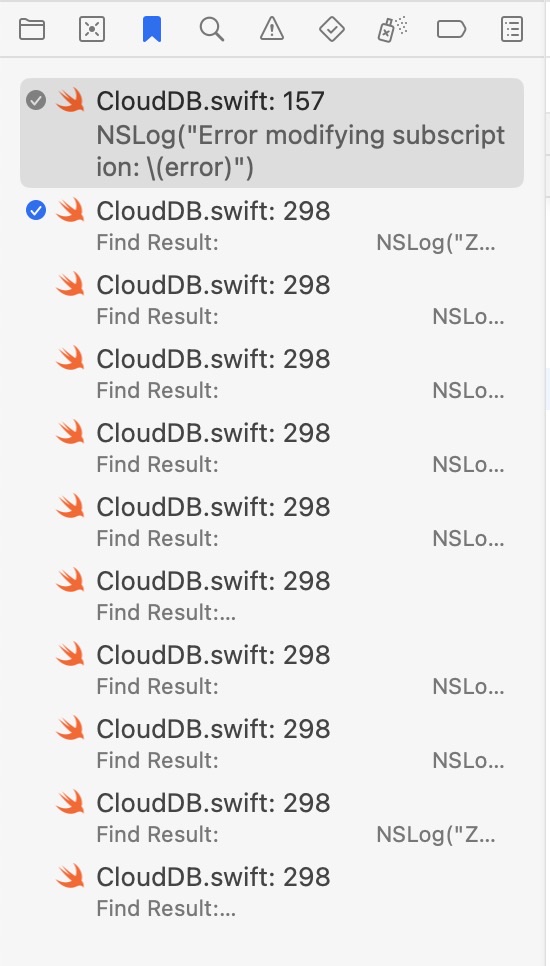
One more cool Xcode 15 beta feature — well, at least “cool” for me since I love ticking things off a list 😛
You can bookmark things in your Xcode project and then mark them off one by one as done. Saves me having to put down all the stuff I want to fix in a separate file 😀
#WWDC #Apple #Xcode15Beta #Bookmarks
A screenshot of the Xcode 15 be…
You can bookmark things in your Xcode project and then mark them off one by one as done. Saves me having to put down all the stuff I want to fix in a separate file 😀
#WWDC #Apple #Xcode15Beta #Bookmarks
A screenshot of the Xcode 15 be…
Fahim Farook
f
Edited 2 years ago
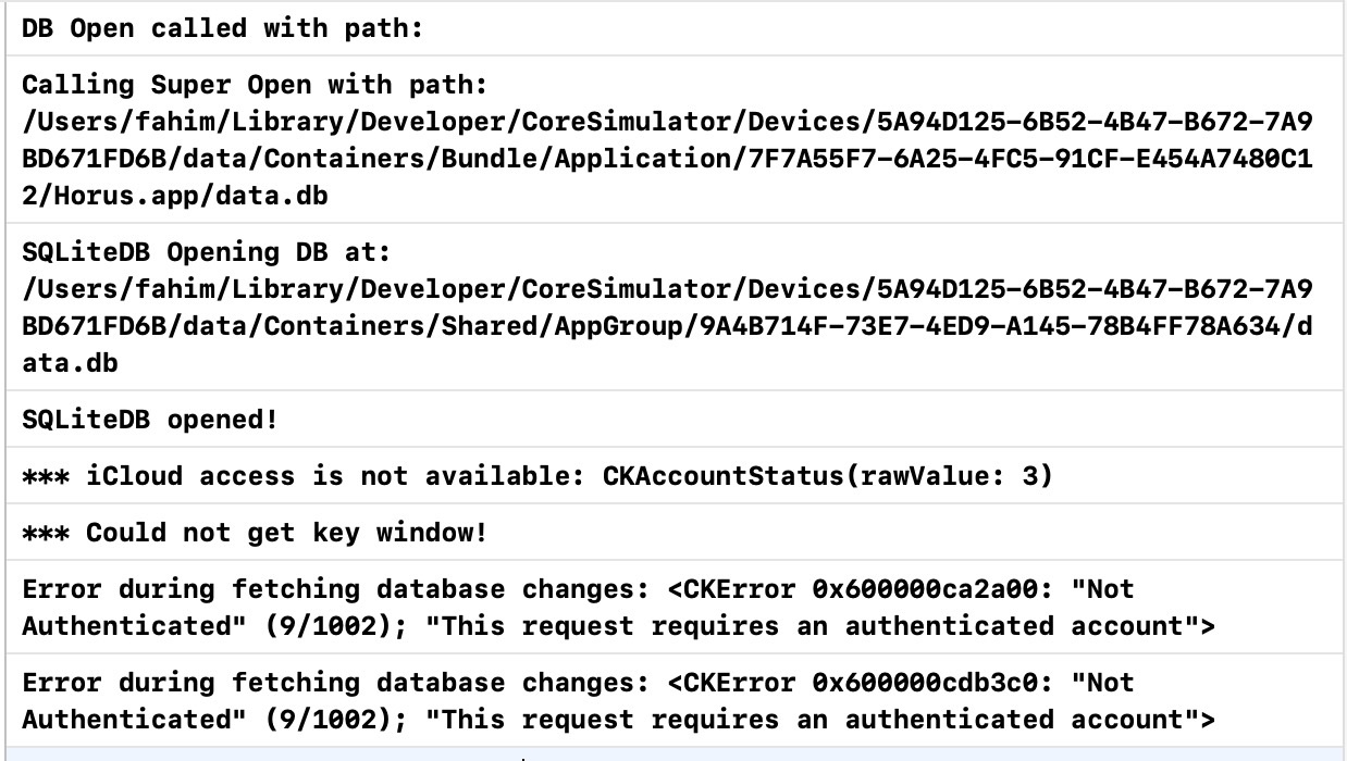
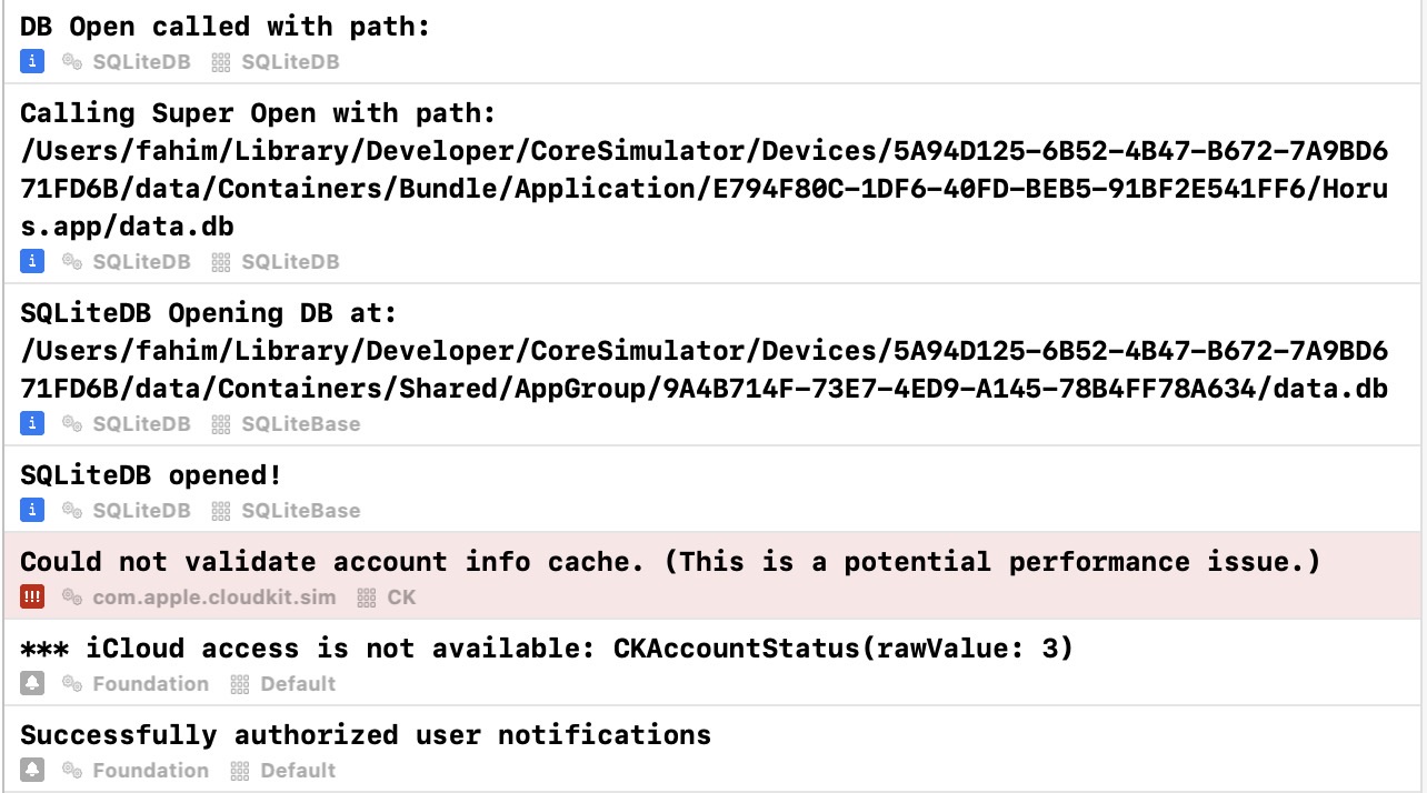
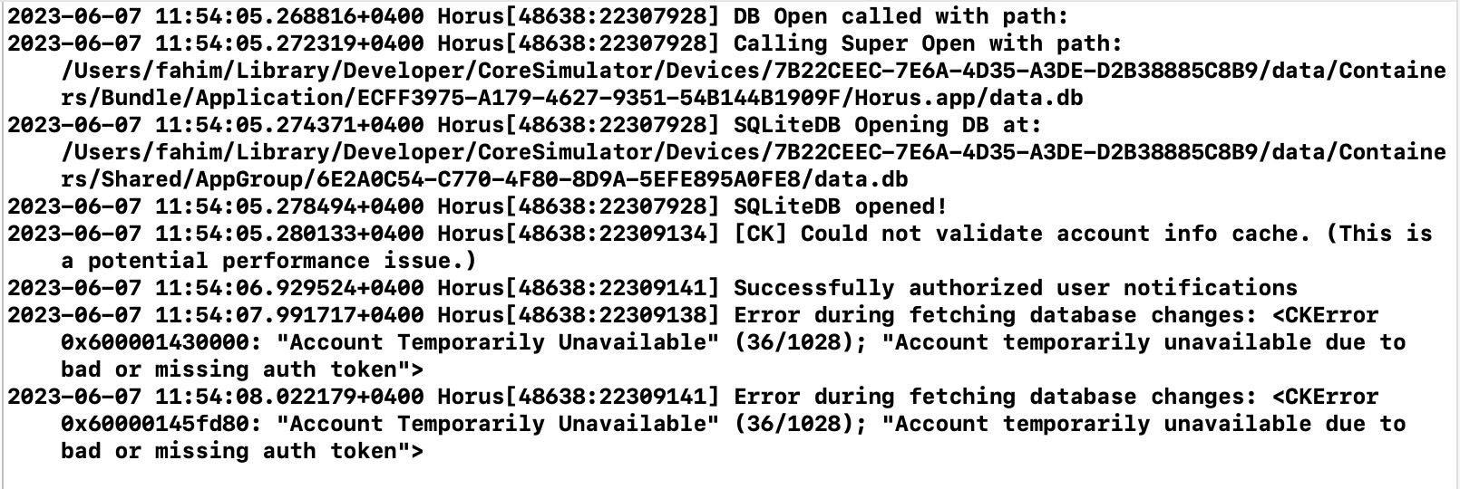
So, I mentioned Xcode 15 beta console logging in my previous post …
With just NSLog statements (and without extra metadata options turned on) the console looks like the first screenshot.
But if you switch to unified logging (so that you can specify the type, subsystem, and category) for each log message, and then turn on the relevant metadata options in the Xcode 15 console, then the console logs look like the second screenshot 🙂
So much better, right? And it’s so much easier to filter too! I think, I’m going to find it hard to go back to Xcode 14.x now … 😛
#Apple #WWDC2023 #Xcode15Beta #Console #Logging
Bare console logs from Xcode 15…
Xcode 15 beta console logs for …
Fahim Farook
f
I want to start using Xcode 15 beta right now just for the console logging 😀
I was using NSLog (for the metadata) but had not moved on to using full-on logging because there didn’t seem to be a huge advantage (till now) with regards to how I used the Xcode console … that was until now 😛
The first screenshot shows console logs from Xcode 14.x for one of my projects.
The second screenshot shows console logs from Xcode 15 beta for the same project with no changes.
So much cleaner and easier to read, right?
But it doesn’t stop there! If you actually use the unified logging system instead of NSLog and tag your log messages with the type of log message, the subsystem and category, the console logging gets even more useful — and a lot more easier to filter.
I’ll post about that in another post once I’ve updated my project …
#Apple #WWDC2023 #Xcode15Beta #Logging #Console
Console logs in Xcode 14.x for …
Console logs in Xcode 15.x for …
Fahim Farook
f
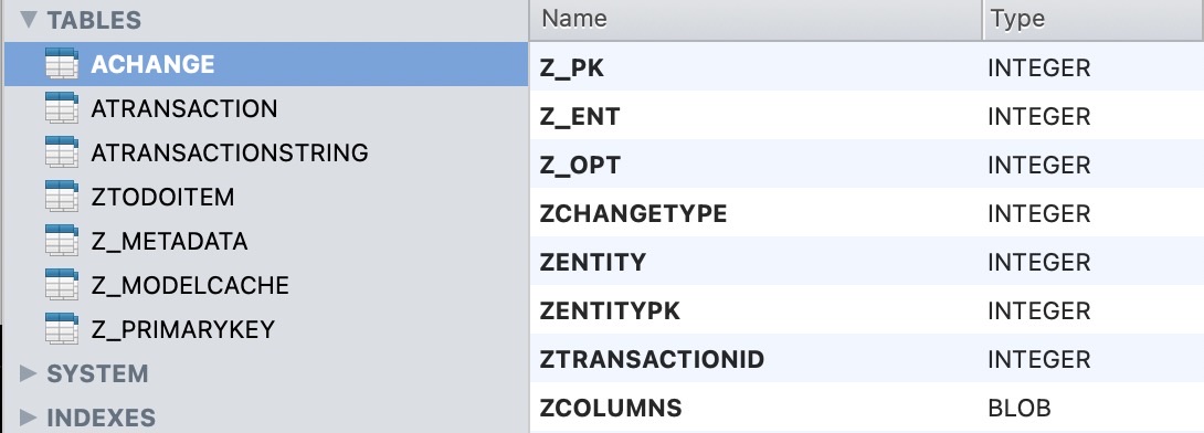
I was curious as to what the underlying data format for SwiftData was …
Apparently, I missed this during the keynote (or I did hear it but didn’t pay enough attention) but it appears that SwiftData uses Core Data (or something pretty similar to Core Data) under the hood.
The screenshot shows the DB used by a sample SwiftData app and the file is simply an SQLite DB. And on a cursory inspection, the data structures look pretty similar to how Core Data stores data 🙂
Of course, I don’t use Core Data much, so I can’t be absolutely sure, but I do have to wonder how it would work if you had a Core Data-based app and simply wanted to switch over to SwiftData? Is there a way to use the existing data without any migration at all?
Interesting to consider …
At least one thing I know of for sure is that there’s an easy way to view/modify SwiftData persisted data since the underlying database is SQLite 🙂
#Apple #WWDC2023 #SwiftData #DataPersistence
Screenshot of an SQLite databas…
Fahim Farook
f
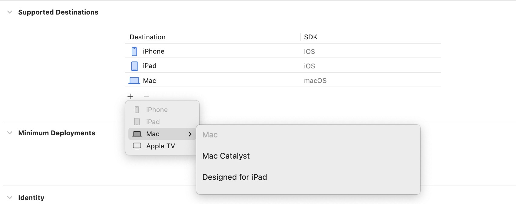
Since the VisionOS SDK will not be released till later, I didn’t expect this to be there, but I was still curious 😛
Looks as if there is no option to add a Vision Pro destination for an Xcode 15 beta project yet …
#Apple #XcodeBeta #WWDC2023
Screenshot showing all the opti…
Looks as if there is no option to add a Vision Pro destination for an Xcode 15 beta project yet …
#Apple #XcodeBeta #WWDC2023
Screenshot showing all the opti…
Fahim Farook
f
In Xcode 15 beta, when you create a new project, you now can select storage options and can switch between SwiftData and Core Data 🙂
#Apple #WWDC2023 #SwiftData #Beta
New project options dialog in X…
#Apple #WWDC2023 #SwiftData #Beta
New project options dialog in X…
Fahim Farook
f
I tried to explain the issues I was having with the current SwiftUI navigation options yesterday, but I don’t think I did a good job 🙂 So here’s a second stab at it …
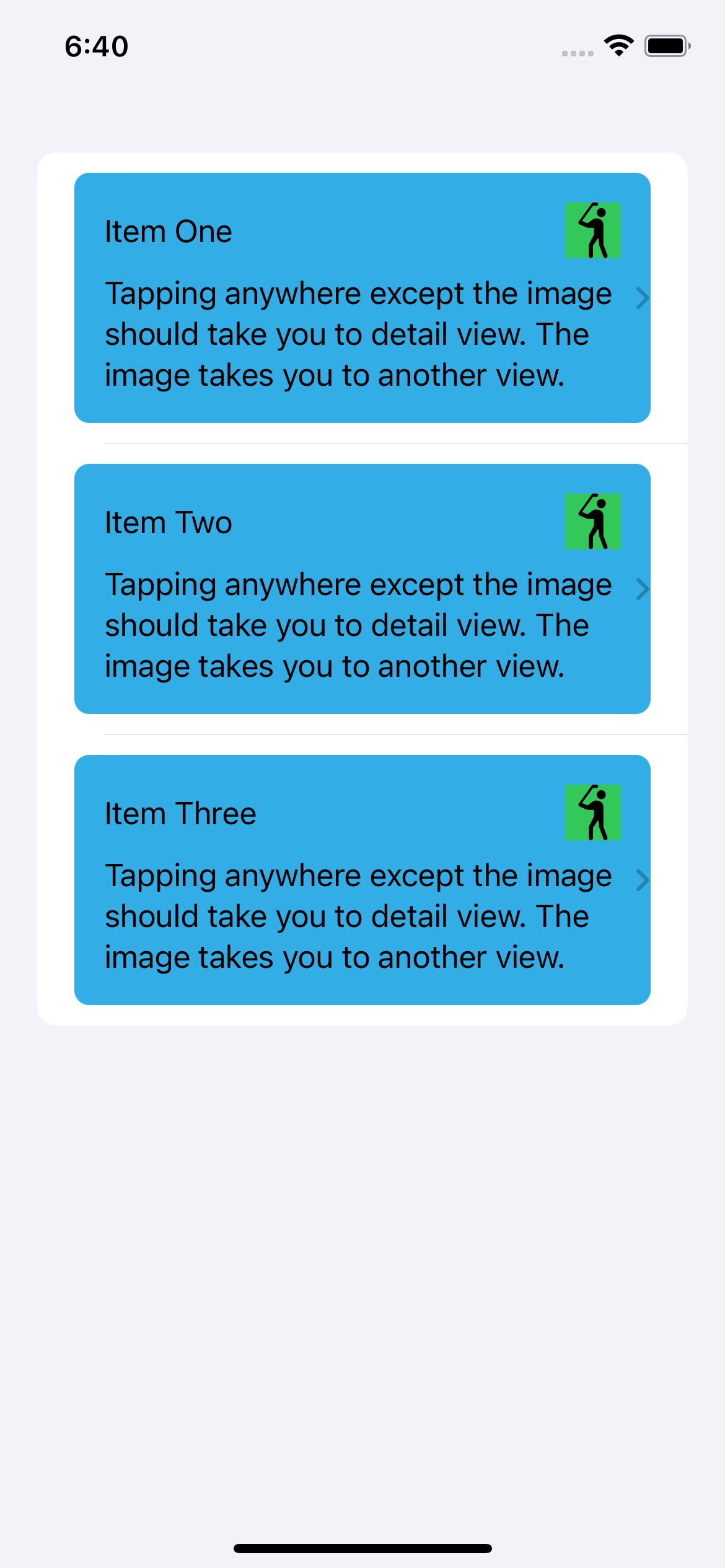
Basically, my understanding is that the only out-of-the-box way to show new views is to either use a NavigationLink or a sheet. I had a List where I wanted the user clicking on the list cell to take them to one view and the user clicking on a button within the list view to take them to another view. (See screenshot #1). This was fairly easy to do in UIKit.
But when I use NavigationLinks for both items, they automatically add these disclosure indicators and doubles them for two NavigationLinks (yes, I know you can hide them with some jugglery, but you shouldn’t need to do that). Worse still, you still get taken to only one view no matter where you click 😛
Fine, so two NavigationLinks in the same cell won’t work. So let’s try making one of them (the button) show a sheet instead. That should work, right?
And this does indeed work. (See screenshot #2).
So all is well? Well kinda … First, I shouldn’t need to show a sheet when I don’t want to. If I want to push a new view in, then I should be able to do so, right?
But leaving that quibble aside, let’s say I want my cell to have a distinctive look. Like in screenshot #3. But now I have the disclosure indicator outside my content cell. And that really doesn’t look good to me …
Oh, but you can put the NavigationLink and the cell content in a ZStack to control that, you say? Sure, but then things look like screenshot #4 😛 Sure, with some more tweaking I can probably get things working right but shouldn’t this be easier?
Also, do note that you can set the opacity of the NavigationLink to 0 and hide the disclosure indicator altogether and yet have the NavigationLink work. And that’s what I did in my app, but in that app, setting things up this way wouldn’t work for the two separate views. Tapping on the button would launch both the detail view and the other view.
But it works correctly here. So I think I must have gotten something subtle wrong in the other implementation.
However, if you want to avoid all these hassles, you might want to try out this package:
https://github.com/DoubleSymmetry/XNavigation
It let me do view navigation the way I wanted to, instead of having to use sheets when I didn’t want to use sheets 😛
If you have a better way to do what I was trying to do, please do let me know. I’m always eager to learn 🙂
Disclaimer: I am not affiliated to the developer of the package in any way. I just liked how it made navigation so much easier … at least for the use cases I had.
#iOS #SwiftUI #Coding #Navigation #Apple
Screenshot #1. Trying to use tw…
Screenshot #2. The button/image…
Screenshot #3. Adding a backgro…
Screenshot #4. The disclosure i…
Fahim Farook
f
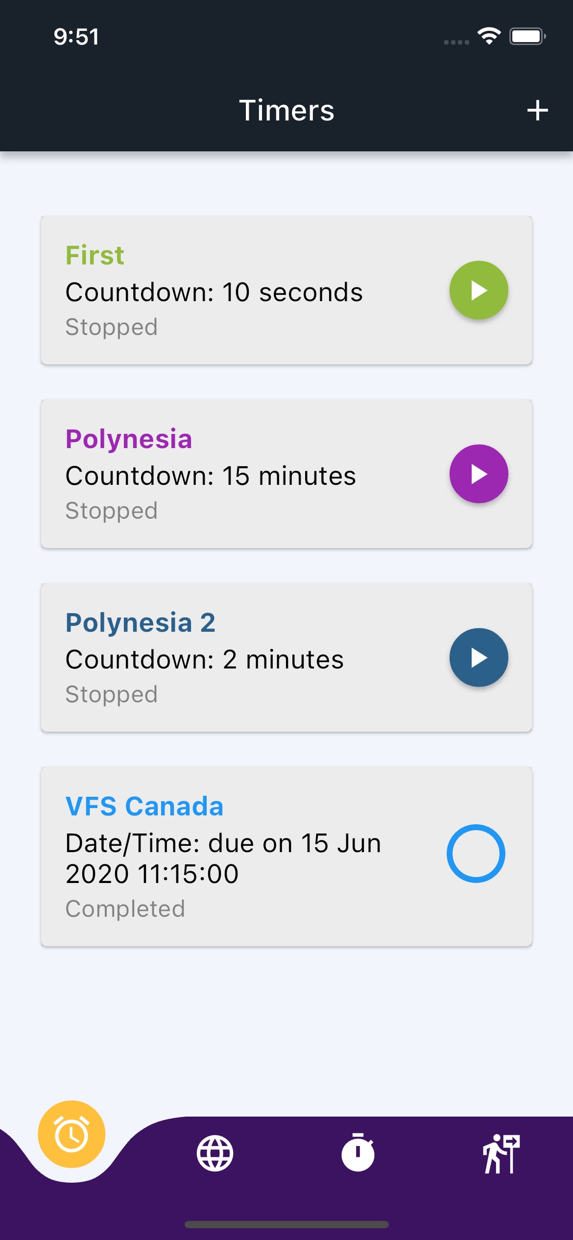
A few years back, I wrote a timer app for my wife since she was tired of how you can’t have more than one iOS timer running at a time. She would want to have two or more timers running at the same time and you just couldn’t do it with the default iOS timer …
At that time, I was heavily into Flutter and so did the app in Flutter so that we could have the timer on either iOS or Android.
After some time, my wife stopped using the app for some reason (we don’t remember why now) and I stopped working on it.
A few days ago, I wanted a recurring timer — one which would fire hourly for say 10 hours during the day and couldn’t find something that worked and wasn’t full of ads 🙂 So I went back to my old timer app.
So much time had passed that the Flutter app took me about a day to get back to working condition. But I kept feeling as if the process was slow … too slow. Just compiling the code to run the app would take a couple of minutes and that just added up. Plus there were other issues.
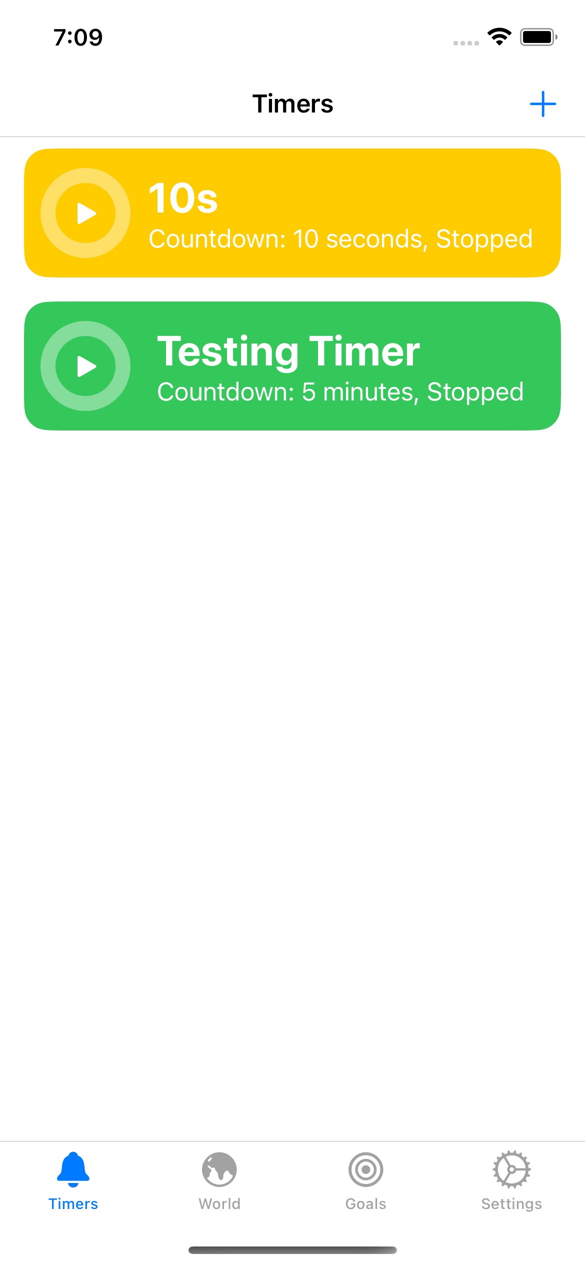
So I did some scrounging around and found that I had another version of the code — an early attempt to turn the app into a SwiftUI app. It took me only about a day of work and I already have that doing the basic stuff and getting close to feature parity to the Flutter version.
It’s interesting how different languages evolve and change over time and what you thought was the best at one point no longer is …
Screenshots for comparison below.
#Timers #Coding #iOS #Flutter #SwiftUI
Screenshot of an iOS app with m…
Screenshot of an iOS app writte…
Fahim Farook
f
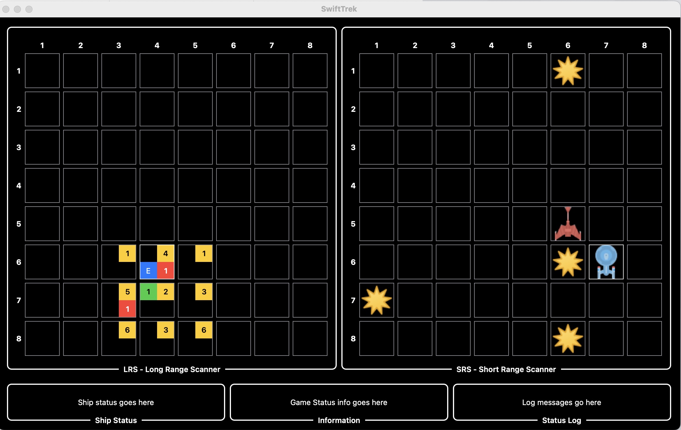
Looks as if the “Trek” game re-make is continuing … at least for a bit 😛
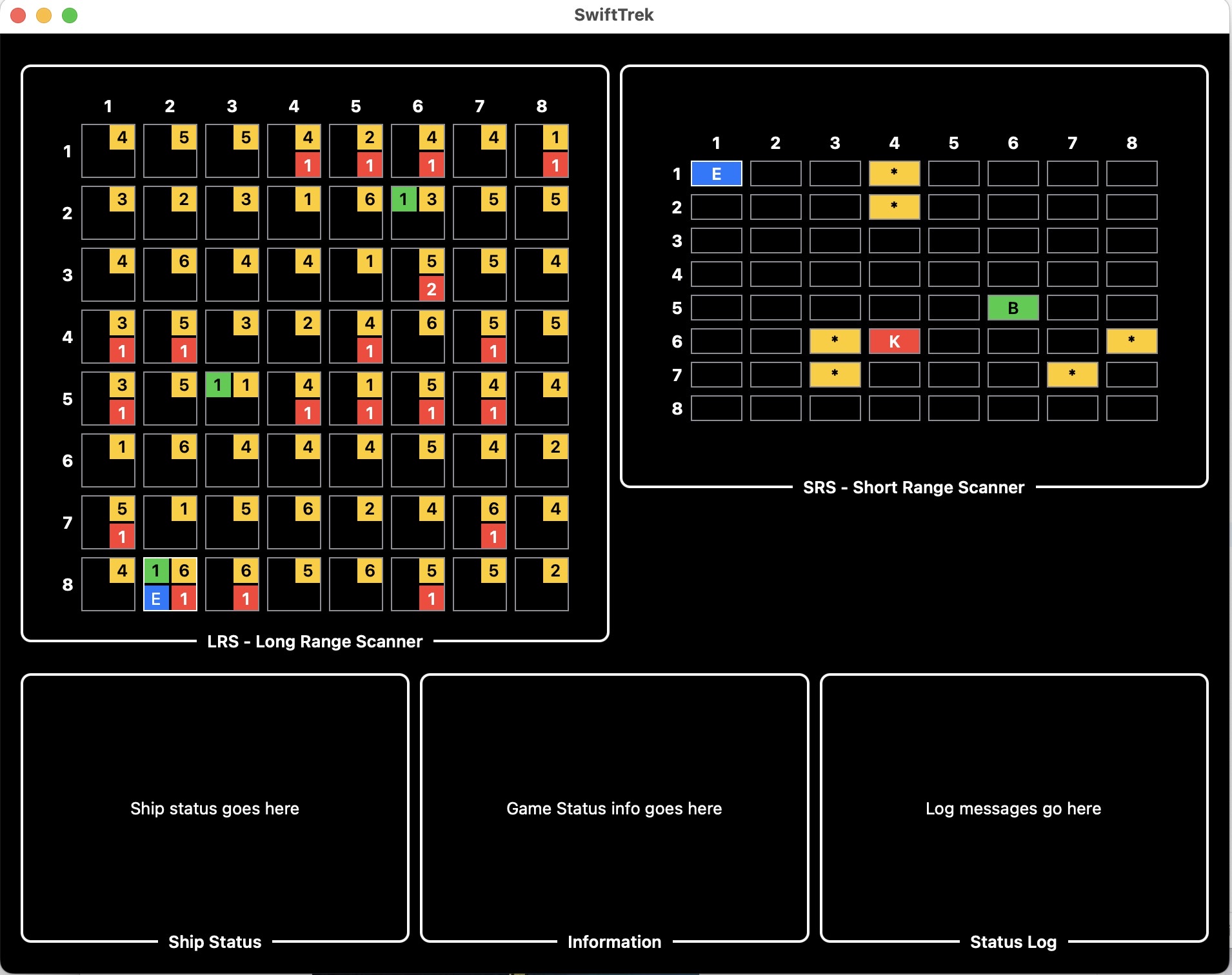
I got some coding time yesterday and so did some more work. Now the Long Range Scanner and Short Range Scanner work and you can navigate in either scanner view by simply tapping where you want to go … So progress 🙂
Also made things look a little bit prettier … though that might be my opinion and not yours 😛
Maybe next weekend I’ll get to do some more work, I guess we’ll see … While I think Flutter would have made this even more easy to code, SwiftUI has held its own so far …
#Game #StarTrek #Coding #SwiftUI #macOS
A screenshot from WIP “Trek” ga…
Fahim Farook
f
@troz I’ve made a bit more progress since I like working out the UI and figuring out how it should all work in this new version … But not sure if I’ll get around to completing it. Will let you know if I do 🙂
WIP screenshot from “Trek” game…
WIP screenshot from “Trek” game…
Fahim Farook
f
I think I’ve talked about the old “Trek” game on here at least once or twice 🙂
I think I might be obsessed with it — mostly because there is this one magical version I remember from the early 90s that I can’t seem to find anywhere. (Of course, the magic might be all in my mind … or in the fact that I can’t find it 😛)
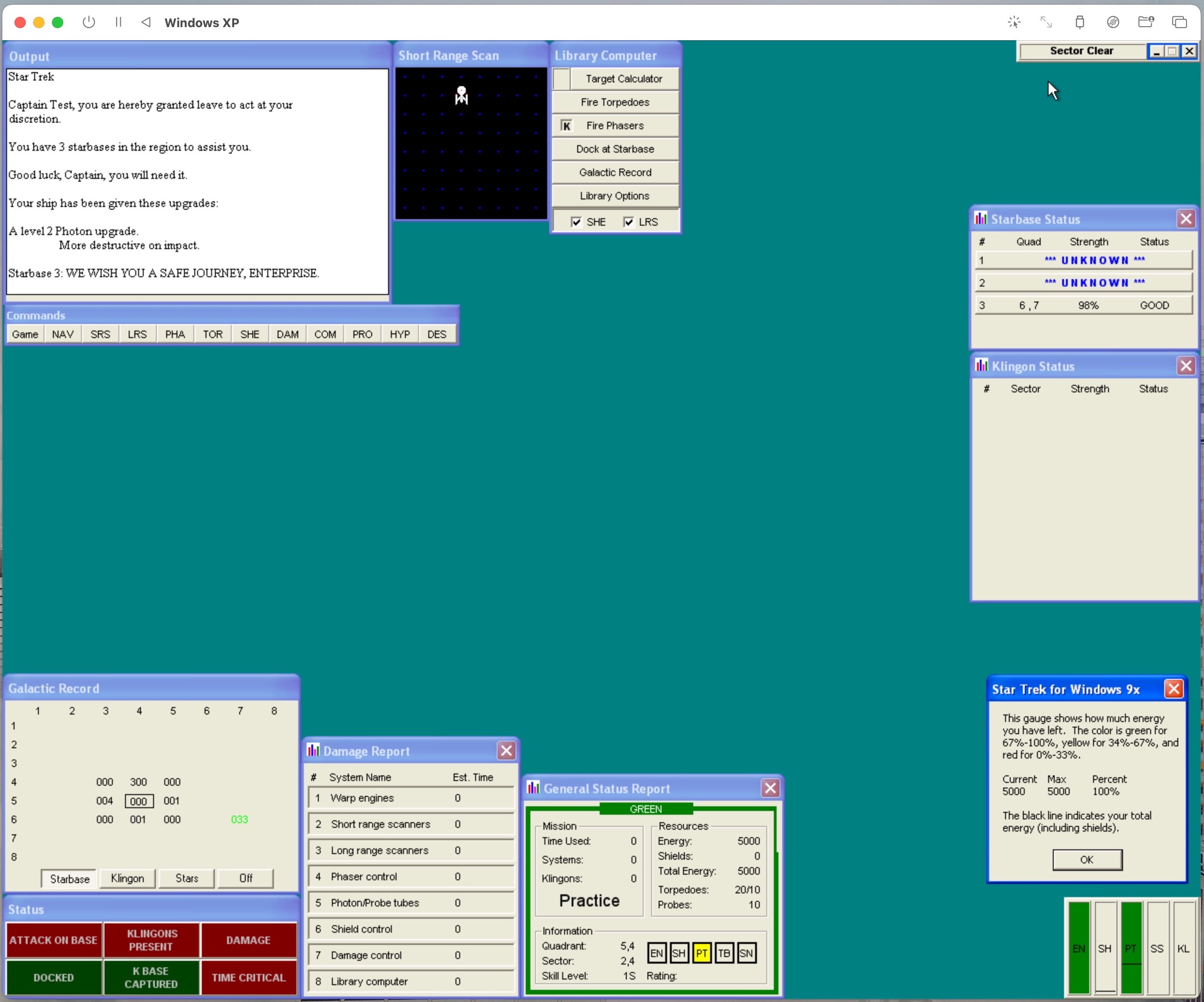
I did some fiddling with a Mac OS 9 emulator this weekend and in the process ran across the “Trek” game again and it got me looking at “Trek” games in general again. In the process, I came across a version of the game for Windows 9x that is probably the most feature-filled version that I’ve seen (screenshot attached).
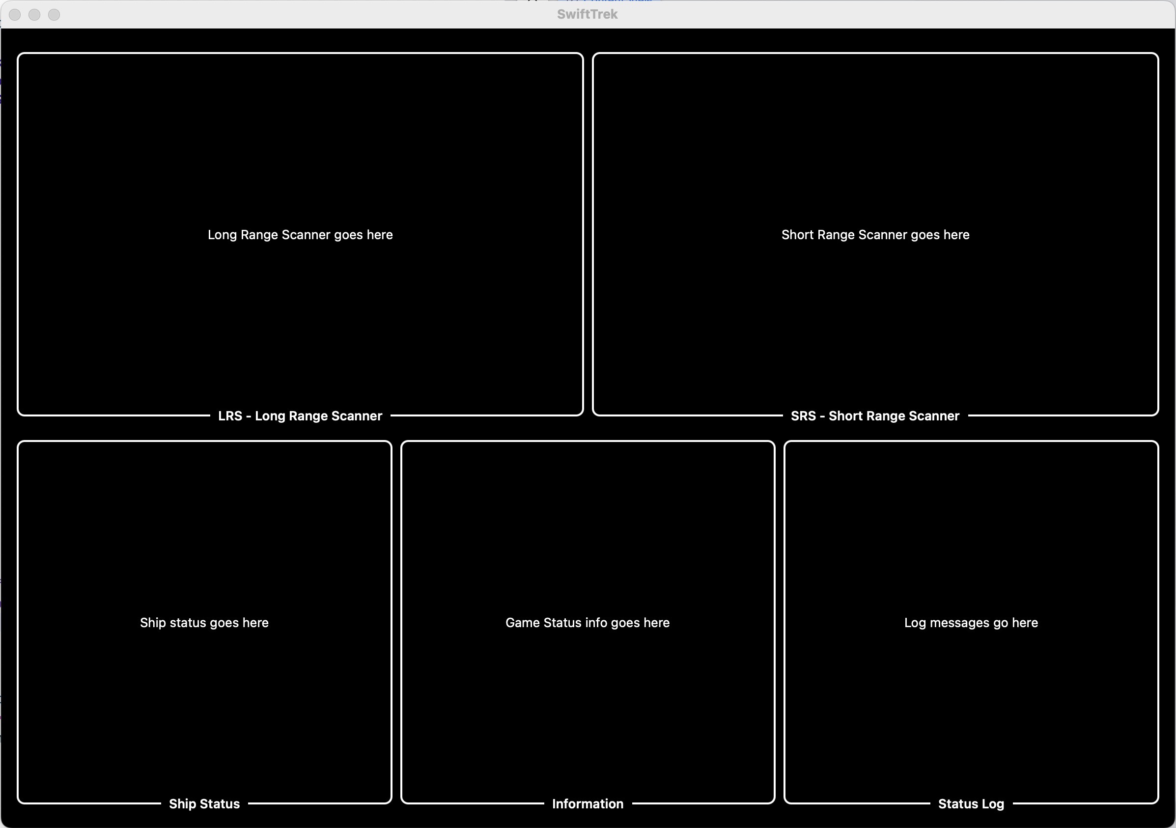
That made me think of re-writing a version of the game myself and I kind of got started last night. All I have so far is a plan for what I want it to look like … or at least half a plan (second screenshot).
Not sure if I’ll actually go through with completing it, but it’s a nice thing to dream about 🙂
#Game #StarTrek #Coding #SwiftUI
A screenshot from the game “Sta…
A screenshot from an early atte…
Fahim Farook
fDecided to give DeepFloyd a try today on macOS.
The good news? It works … kinda 😛
The bad news? It doesn’t work all the way … as was to be expected 🙂
I took the following code from their GitHub repo (https://github.com/deep-floyd/IF) and modified for an Apple Silicon (M1) Mac. Here’s the actual code I ran:
from diffusers import DiffusionPipeline
from diffusers.utils import pt_to_pil
import torch

# stage 1
stage_1 = DiffusionPipeline.from_pretrained("DeepFloyd/IF-I-M-v1.0").to("mps")

# stage 2
stage_2 = DiffusionPipeline.from_pretrained("DeepFloyd/IF-II-M-v1.0", text_encoder=None).to("mps")

# stage 3
safety_modules = {"feature_extractor": stage_1.feature_extractor, "safety_checker": stage_1.safety_checker, "watermarker": stage_1.watermarker}
stage_3 = DiffusionPipeline.from_pretrained("stabilityai/stable-diffusion-x4-upscaler", **safety_modules).to("mps")

prompt = 'a photo of a kangaroo wearing an orange hoodie and blue sunglasses standing in front of the eiffel tower holding a sign that says "very deep learning"'

# text embeds
prompt_embeds, negative_embeds = stage_1.encode_prompt(prompt)

generator = torch.manual_seed(0)

# stage 1
image = stage_1(prompt_embeds=prompt_embeds, negative_prompt_embeds=negative_embeds, generator=generator, output_type="pt").images
pt_to_pil(image)[0].save("./if_stage_I.png")

# stage 2
image = stage_2(image=image, prompt_embeds=prompt_embeds, negative_prompt_embeds=negative_embeds, generator=generator, output_type="pt").images
pt_to_pil(image)[0].save("./if_stage_II.png")

# stage 3
image = stage_3(prompt=prompt, image=image, generator=generator, noise_level=100).images
image[0].save("./if_stage_III.png")
You have to make sure that diffusers, transformers, and accelereate (at least in my own trial) are fully up-to-date. The larger models probably work too but it took too long to download/test and so I opted for the smallest models.
Stage I and II generated images but stage III errored out. I will need to figure out what happened there later …
Resulting images are attached …
#DeepLearning #MachineLearning #DeepFloyd #ImageGeneration
Stage I image — 64 x 64 in size…
Stage II image — 256 x 256 in s…
Fahim Farook
f
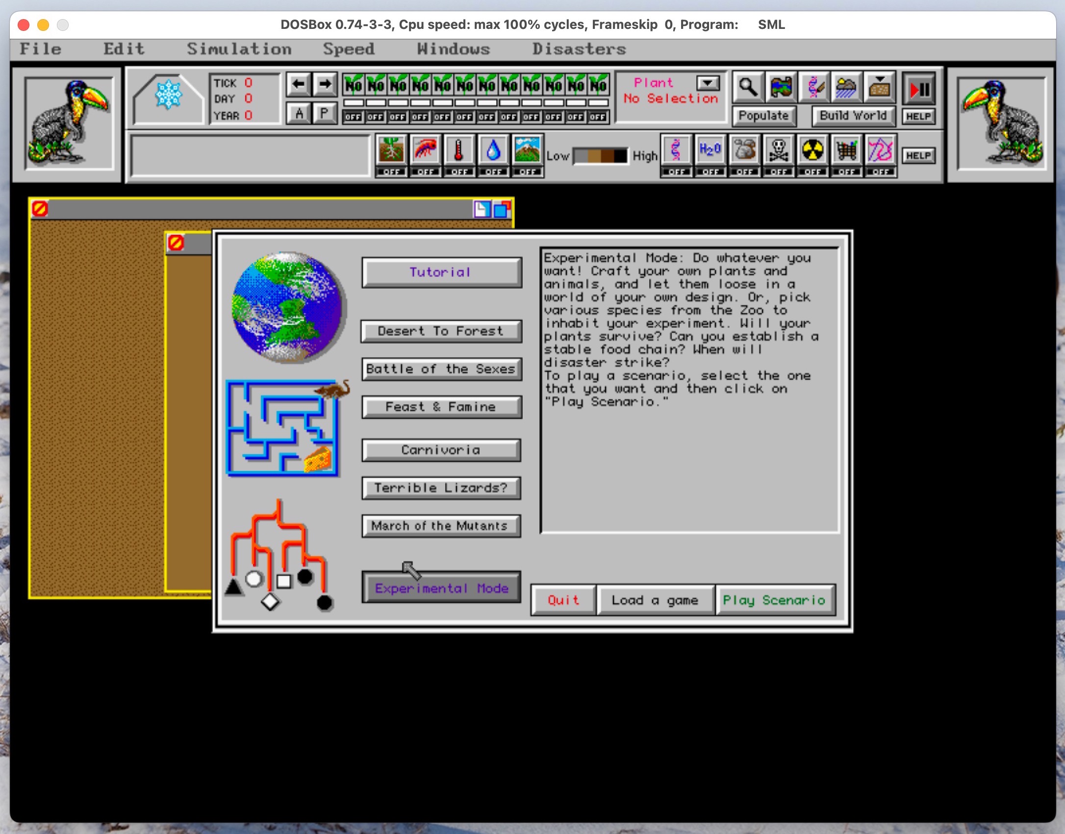
So … DOSBox …
On Friday, once work was done, I kind of started thinking about “SimLife”.
I’d posted about it a week or two ago and I thought it might be fun to try it out again and see if it was as bad as I remembered.
I went and installed DOSBox (https://www.dosbox.com/) but discovered that Boxer (http://boxerapp.com/) no longer worked for my version of macOS since it has not been updated in ages — shows how long it’s been since I tried DOSBox I guess 😛
That sent me down all sorts of byways and alleyways trying out various alternatives to Boxer and even setting up MS-DOS 6.22 on a VM but I eventually came back to DOSBox since it was the easiest/simplest way to get going.
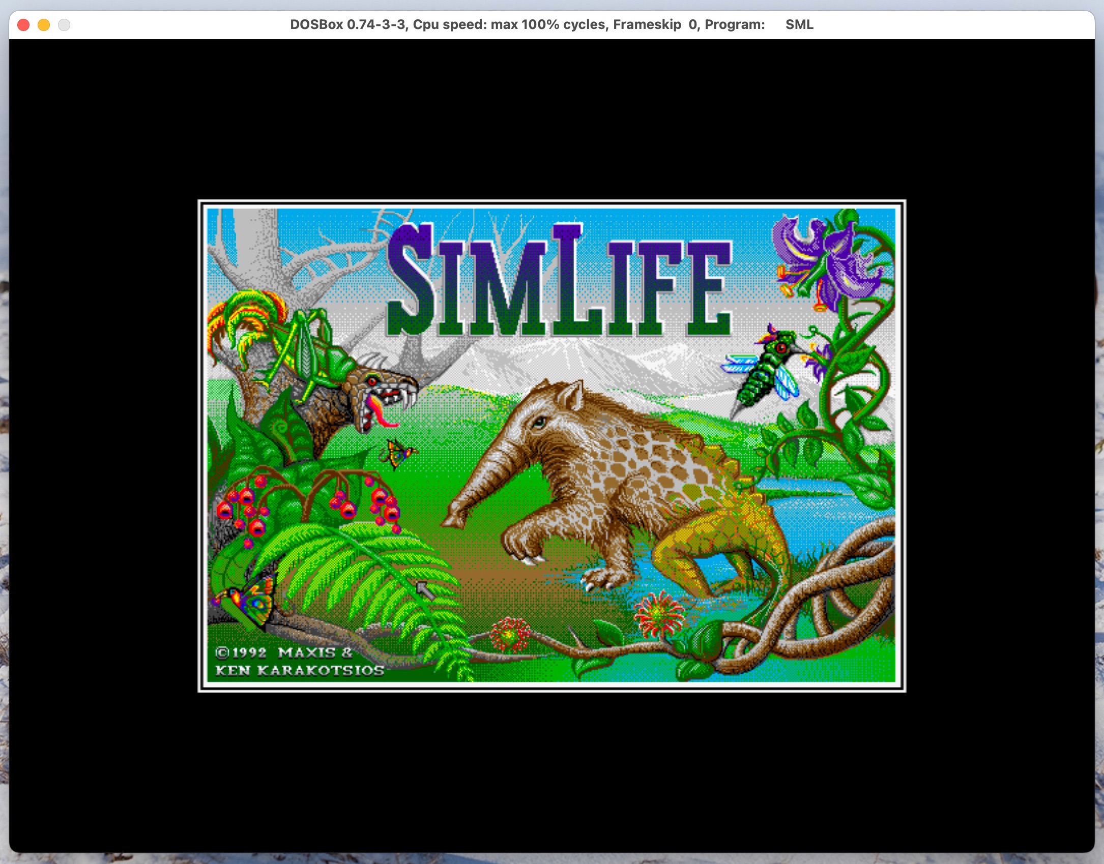
I tried out “SimLife” again and was pleasantly surprised to find that I actually kind of liked the game. I probably hadn’t tried out the tutorial back in the day and probably just tried clicking around and it’s the kind of game where you really need to know the mechanics. So I might try playing it again over the next few weeks …
But that opening graphic, so gorgeous even for that time period — just so lovely 🙂
#Games #DOS #Memories #Sim #History
“SimLife” opening graphic / spl…
“SimLife” game start showing th…
Fahim Farook
f
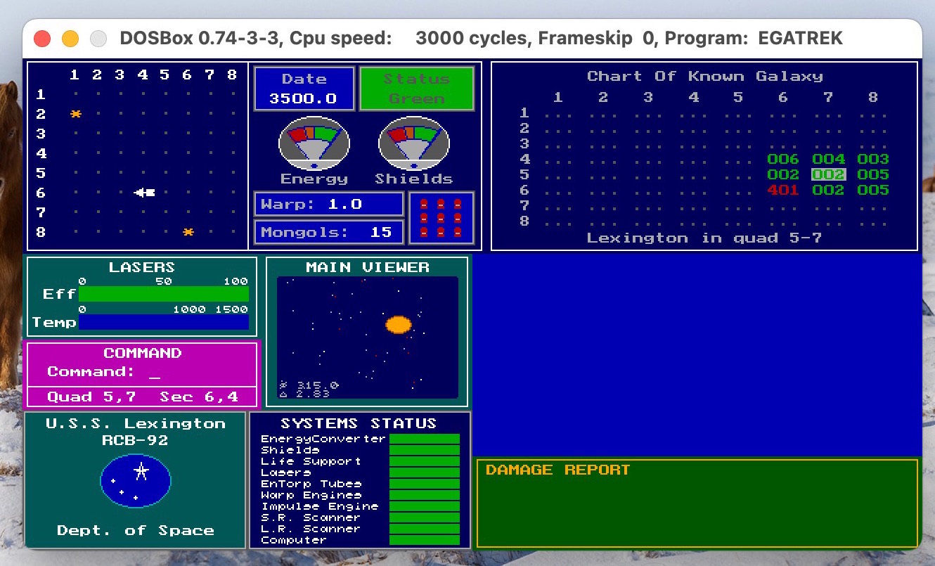
Does anybody remember the classic “Star Trek” game from the 70’s? Or was that way before anybody’s time? 😛
I was playing around with DOSBox (more on that in a separate post) and was reminded of the game suddenly.
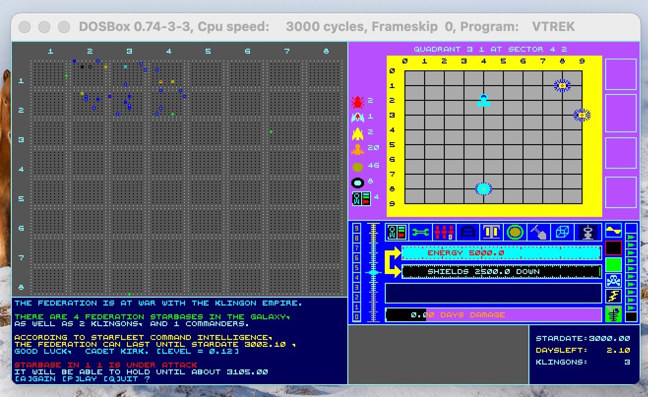
I recall playing a version on DOS back in 1990 (or 91) which had color graphics and more graphical controls than “Trek73” or “Super Trek”. The closest one I can find now is “EGA Trek” (see first screenshot) but I’m fairly certain that that wasn’t the one I played because the Main Viewer area in “EGA Trek” cycles through different graphics and I don’t remember that.
Also the game I played had long range and short range scanners which used up energy and that doesn’t seem to be a feature of “EGA Trek”.
Now that I’ve remembered the game, I really want to play that exact version again 😛
I’ve played “EGA Trek”, “VTrek” (second screenshot) and gone through a bunch of newer variations that people created on GitHub. But none of them have the same feel as the game I remember. If anybody knows of the game I’m talking of, please let me know?
I think part of the trouble is that back then they were all called “Star Trek” and that was it. So many variations by so many people.
In fact, I thought the one I liked might have been created in Turbo Pascal (for no reason I could think of) and almost went down another rabbit hole setting up Turbo Pascal just to re-create the game for DOS 😛
Then I realized that if I were to re-create it that I might as well do it in Swift or Flutter so that I can have it avaialbe on more platforms. Will I do it? I don’t know … I guess it depends on how badly I want to play the version I remember again 🙂
#Games #StarTrek #DOS #Memories #History
“EGA Trek” game screen showing …
“VTrek” game screen showing a b…
Fahim Farook
f
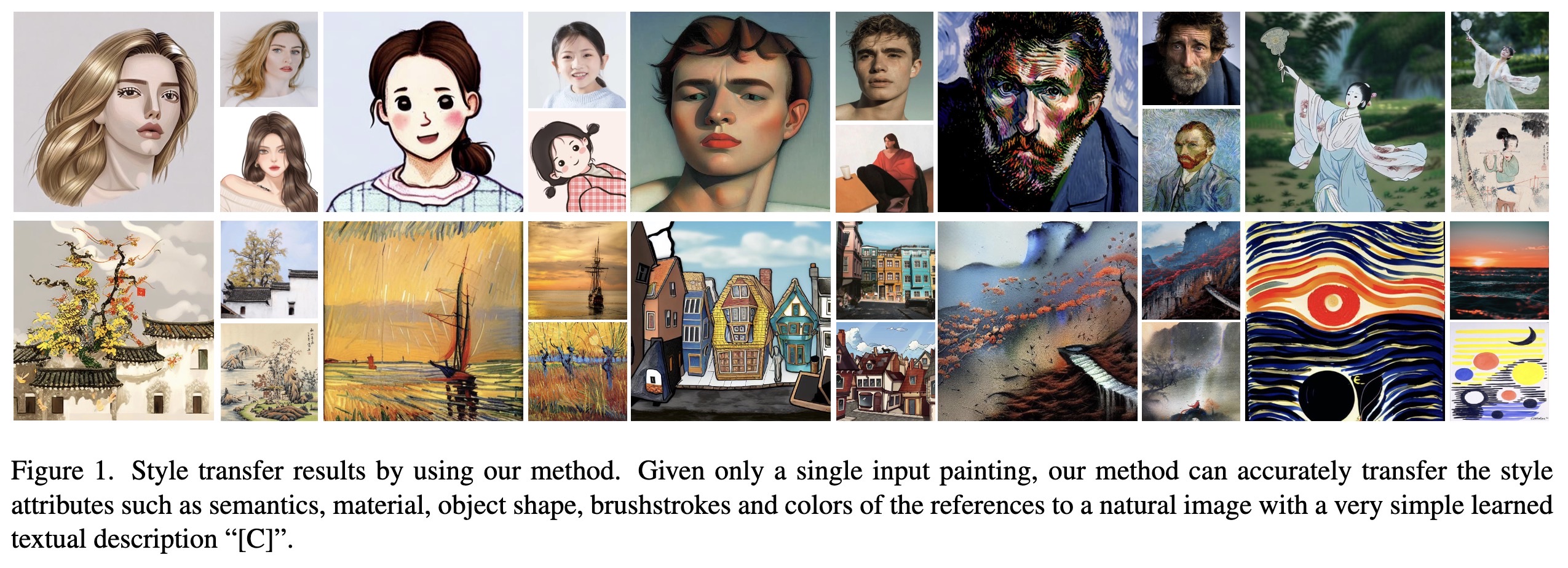
"Inversion-Based Style Transfer with Diffusion Models. (arXiv:2211.13203v2 [cs.CV] UPDATED)" — Accurately transfer the style attributes such as semantics, material, object shape, brushstrokes and colors of an input image to the target image.
Paper: http://arxiv.org/abs/2211.13203
Code: https://github.com/zyxelsa/InST
#AI #CV #NewPaper #DeepLearning #MachineLearning
<<Find this useful? Please boost so that others can benefit too 🙂>>
Style transfer results by using…
Paper: http://arxiv.org/abs/2211.13203
Code: https://github.com/zyxelsa/InST
#AI #CV #NewPaper #DeepLearning #MachineLearning
<<Find this useful? Please boost so that others can benefit too 🙂>>
Style transfer results by using…
