Fahim Farook
Posts
1600Following
138Followers
881I'm currently working on my second novel which is complete, but is in the edit stage. I wrote my first novel over 20 years ago but then didn't write much till now.
I post about #Coding, #Flutter, #Writing, #Movies and #TV. I'll also talk about #Technology, #Gadgets, #MachineLearning, #DeepLearning and a few other things as the fancy strikes ...
Lived in: 🇱🇰🇸🇦🇺🇸🇳🇿🇸🇬🇲🇾🇦🇪🇫🇷🇪🇸🇵🇹🇶🇦🇨🇦
Fahim Farook
f
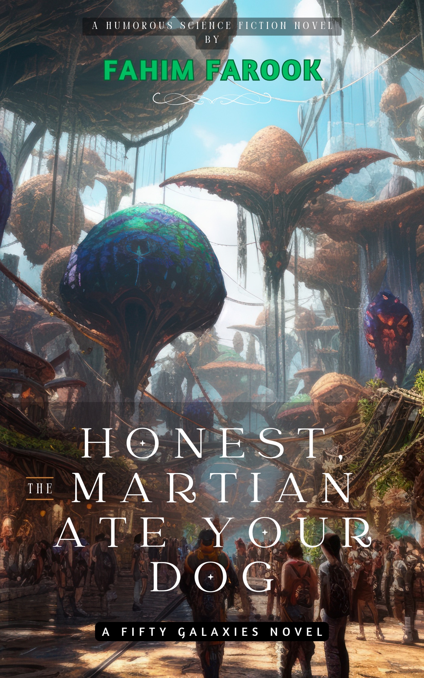
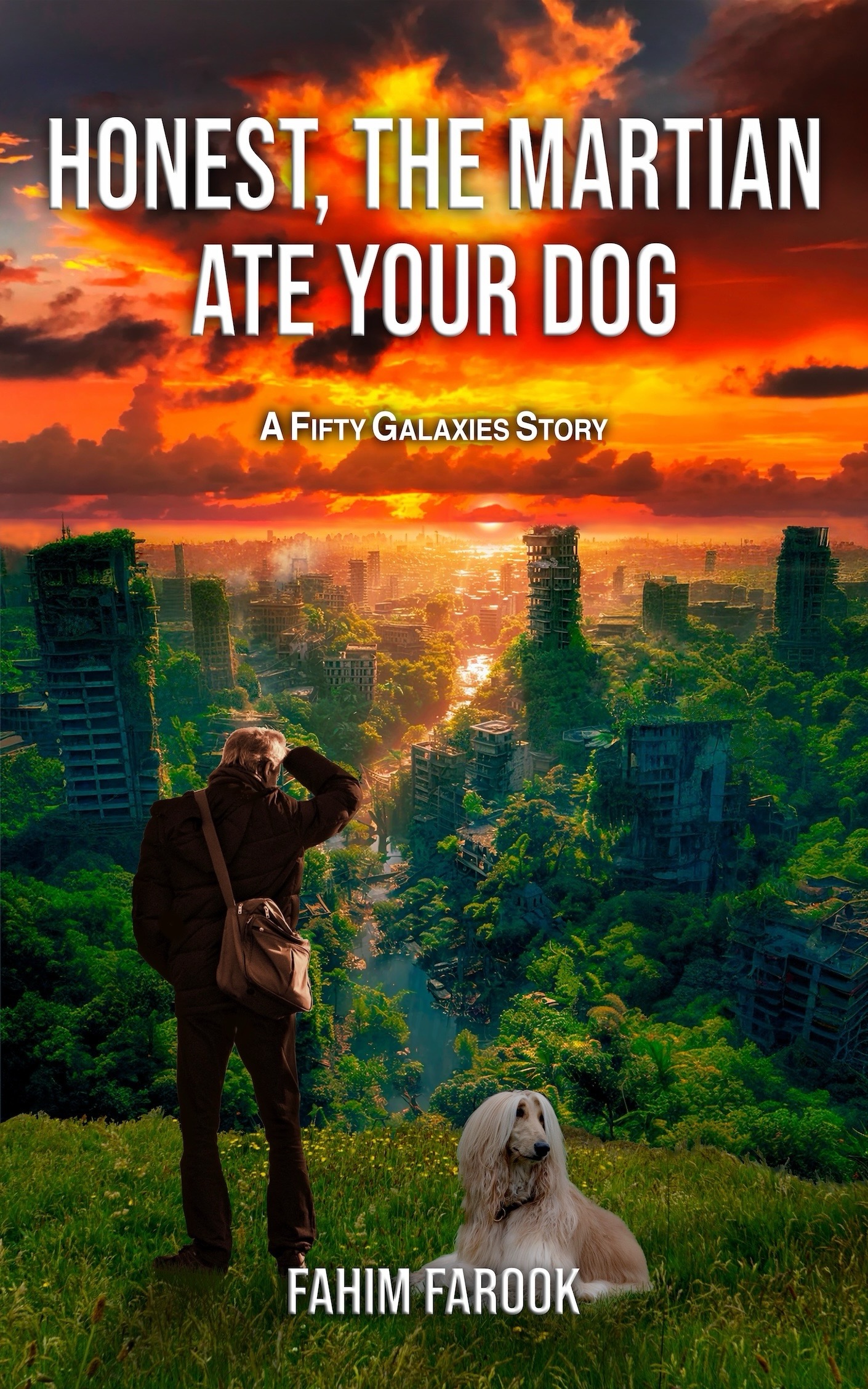
@AngelaPreston Thanks, Angela 🙂I think the overall reaction from most people so far has been that they like the left one (with my name in green) better.
But you're probably one of the few to articulat why 🙂And it's very interesting ot know why because it helps in figuring out what kind of cover might appeal to people generally.
I thought the reason that the orange sky one turned off people was because the orange was too strong. We were experimenting with a few other variations to see if softening the colour might help. But your explanation leads me to think that that isn't the issue at all ...
 0
0
 0
0
 1
1
Fahim Farook
f
@Nichelle I loved the Josh Kirby covers on Terry's books 🙂 The covers were the reason I got into Discworld in the first place.
I did consider something like that when I first started writing but the price that I was quoted (at that time) was astronomical. Still don't have the funds to pay for something like that 😛
But do appreciate the suggestions. The covered tray with a tail stickig out would work though I bet, I'm going to have some very cross people on my case after that too 😀
0
0
2

Fahim Farook
f
@alexito4 I've just shifted focus on the existing account for the same reason 🙂 Creating a second account is probably cleaner, but I'm moving away from Swift development anyway and it feels like too much effort (to me at least) to create a new profile and build new relationships/userbases.
1
0
1
Fahim Farook
f
@theexplorographer Thank you. That information helps. We'll rework it and see if we can make it better 🙂
0
0
0
Fahim Farook
f
@theexplorographer Thank you 🙂 If the orange sky wasn't so in-your-face, would the one on the right appal to you more do you think? The orange sky is my fault, I wanted a distinct sunset but I have a feeling that it might be just a bit too much 😛
0
0
0
Fahim Farook
f
@ariaflame Thank you 🙂 Appreciate the feedback. If the title/font were the same, which image would you prefer?
1
0
0
Fahim Farook
f
I have to replace the cover of my science fiction novel, but I'm torn as to which one to go with. Can you help me figure out which one is the better cover?
Please let me know which one you like. And also, please share for reach 🙂
#ScienceFiction #CoverSelection #IndieAuthor #HelpMeDecide #Bookstodon #FediBooks #Writing
A cover for a science fiction n…
A cover for a science fiction n…
Please let me know which one you like. And also, please share for reach 🙂
#ScienceFiction #CoverSelection #IndieAuthor #HelpMeDecide #Bookstodon #FediBooks #Writing
A cover for a science fiction n…
A cover for a science fiction n…
5
2
3
Fahim Farook
f
After you publish your novel, you need to promote it.
Finding review readers can sometimes be very hard. Here's my follow up thoughts about some book review services after using them for a while. If you're an aspiring author, maybe my experiences will help you avoid some of the traps and pitfalls? I sure hope so!
https://books.farook.org/2024/08/20/book-review-services/
#Writing #IndieAuthor #BookPromo
0
0
1
Fahim Farook
repeated
repeated
Salicarn ⚠️
salicarn@sb17.spaceDoes anyone know of any fiction/poetry-centric corners of the fedi? I've started writing again (at long last!) and would love to find more places to share my own work and engage with other writers.
0
1
0
Fahim Farook
repeated
repeated
Fahim Farook
repeated
repeated