Fahim Farook
f
Please let me know which one you like. And also, please share for reach 🙂
#ScienceFiction #CoverSelection #IndieAuthor #HelpMeDecide #Bookstodon #FediBooks #Writing
A cover for a science fiction n…
A cover for a science fiction n…
 5
5
 2
2
 3
3
Ariaflame
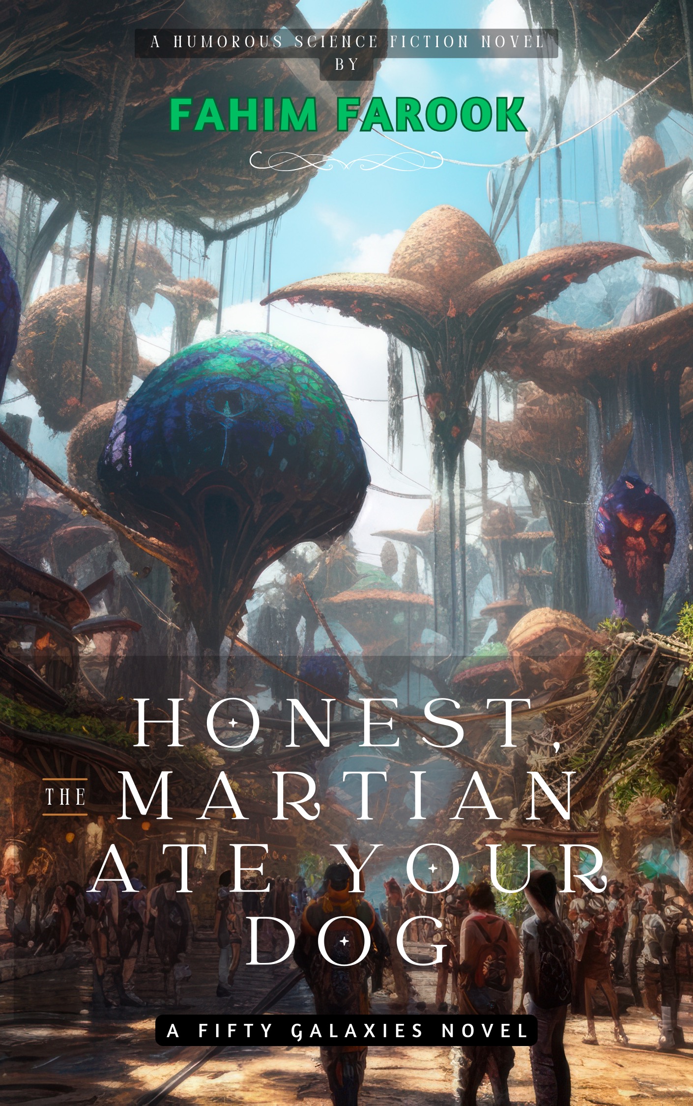
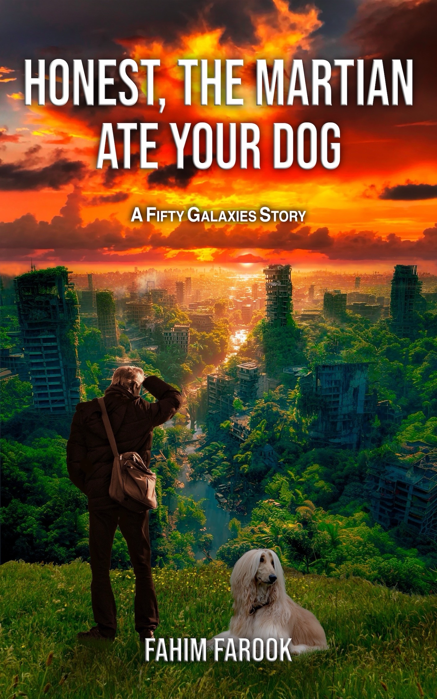
ariaflame@masto.ai@f The one on the right makes the title easier to read, the tiny the on the one on the left is easy to miss. It made Honest Martian sound like a second hand spaceship dealer.
1
0
0
Fahim Farook
f
1
0
0
Fahim Farook
f
0
0
0
@f I prefer the left one (with your name in green), the other one feels a bit outdated to me.
1
0
0
Fahim Farook
f
0
0
0
Nathan Lowell (he/him) 📎
nlowell@zirk.usThe orange one feels too Photo-Shop-y. The font choice, layout, and color scheme say planetary invasion zombie apocalypse to me.
I like the retro-feel and composition of the not-orange one better. It feels more inviting.
The font choice and layout is a bit off the mark, especially the green.
The "Humorous Science Fiction Novel by" needs to go. It's too small to read in thumbnail. If you have to say it on the cover, the cover isn't working.
JMO.
1
0
0
Fahim Farook
fI did consider something like that when I first started writing but the price that I was quoted (at that time) was astronomical. Still don't have the funds to pay for something like that 😛
But do appreciate the suggestions. The covered tray with a tail stickig out would work though I bet, I'm going to have some very cross people on my case after that too 😀
0
0
2
Nathan Lowell (he/him) 📎
nlowell@zirk.usThe readers don't follow the guidelines.
The guidelines help the author understand what message a reader gets from the cover - usually unconsciously.
Space ship on the cover? SF
Elf, Dragon => Fantasy
Look at best seller list on any niche in Amazon. The color schemes, style of art, layout, color schemes will tell you what kind of book it is.
The trick - like with tropes - is figuring out how to stand out while still sending the message you want to give without becoming cliche.
0
0
1
Angela
AngelaPreston@toot.cat@f I like the greenery on the orange sky cover, but I like the other cover (where your name is in green) better overall.
I think the reason I like it is because it reminds me of a cover of another book I read that I liked. The "orange sky" cover is not bad, just not as appealing to me.
1
0
0
Fahim Farook
fBut you're probably one of the few to articulat why 🙂And it's very interesting ot know why because it helps in figuring out what kind of cover might appeal to people generally.
I thought the reason that the orange sky one turned off people was because the orange was too strong. We were experimenting with a few other variations to see if softening the colour might help. But your explanation leads me to think that that isn't the issue at all ...
0
0
1