Posts
1641Following
139Followers
886I'm currently working on my second novel which is complete, but is in the edit stage. I wrote my first novel over 20 years ago but then didn't write much till now.
I post about #Coding, #Flutter, #Writing, #Movies and #TV. I'll also talk about #Technology, #Gadgets, #MachineLearning, #DeepLearning and a few other things as the fancy strikes ...
Lived in: 🇱🇰🇸🇦🇺🇸🇳🇿🇸🇬🇲🇾🇦🇪🇫🇷🇪🇸🇵🇹🇶🇦🇨🇦
Fahim Farook
 repeated
Ron Gilbert (GrumpyGamer)
grumpygamer@mastodon.gamedev.placeBREAKING NEWS! I am looking for a pixel art tile artist for my game. I am paying real $$$.
Fahim Farook
f
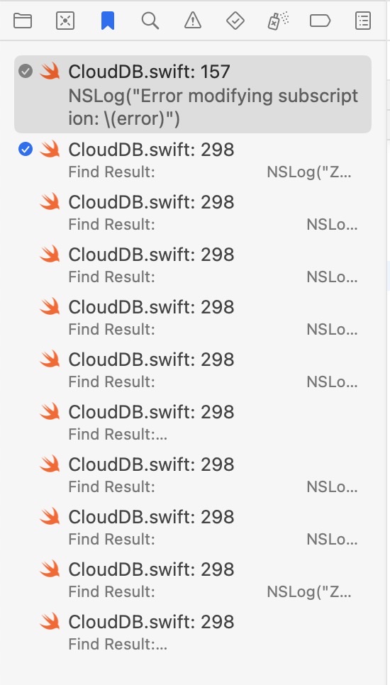
One more cool Xcode 15 beta feature — well, at least “cool” for me since I love ticking things off a list 😛
You can bookmark things in your Xcode project and then mark them off one by one as done. Saves me having to put down all the stuff I want to fix in a separate file 😀
#WWDC #Apple #Xcode15Beta #Bookmarks
A screenshot of the Xcode 15 be…
You can bookmark things in your Xcode project and then mark them off one by one as done. Saves me having to put down all the stuff I want to fix in a separate file 😀
#WWDC #Apple #Xcode15Beta #Bookmarks
A screenshot of the Xcode 15 be…
Fahim Farook
f
Edited 2 years ago
So, I mentioned Xcode 15 beta console logging in my previous post …
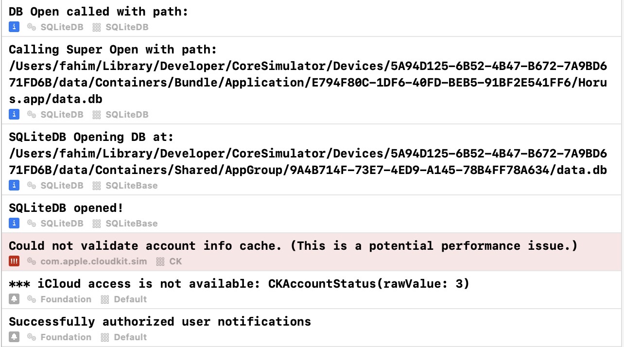
With just NSLog statements (and without extra metadata options turned on) the console looks like the first screenshot.
But if you switch to unified logging (so that you can specify the type, subsystem, and category) for each log message, and then turn on the relevant metadata options in the Xcode 15 console, then the console logs look like the second screenshot 🙂
So much better, right? And it’s so much easier to filter too! I think, I’m going to find it hard to go back to Xcode 14.x now … 😛
#Apple #WWDC2023 #Xcode15Beta #Console #Logging
Bare console logs from Xcode 15…
Xcode 15 beta console logs for …
Fahim Farook
f
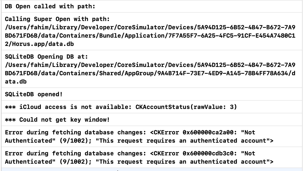
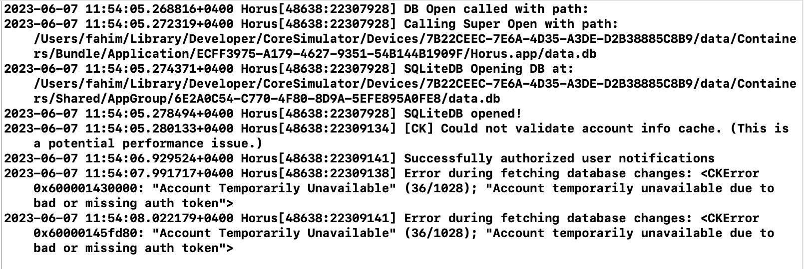
I want to start using Xcode 15 beta right now just for the console logging 😀
I was using NSLog (for the metadata) but had not moved on to using full-on logging because there didn’t seem to be a huge advantage (till now) with regards to how I used the Xcode console … that was until now 😛
The first screenshot shows console logs from Xcode 14.x for one of my projects.
The second screenshot shows console logs from Xcode 15 beta for the same project with no changes.
So much cleaner and easier to read, right?
But it doesn’t stop there! If you actually use the unified logging system instead of NSLog and tag your log messages with the type of log message, the subsystem and category, the console logging gets even more useful — and a lot more easier to filter.
I’ll post about that in another post once I’ve updated my project …
#Apple #WWDC2023 #Xcode15Beta #Logging #Console
Console logs in Xcode 14.x for …
Console logs in Xcode 15.x for …
Fahim Farook
f
I was curious as to what the underlying data format for SwiftData was …
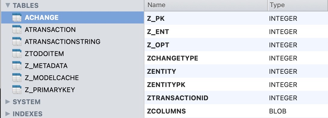
Apparently, I missed this during the keynote (or I did hear it but didn’t pay enough attention) but it appears that SwiftData uses Core Data (or something pretty similar to Core Data) under the hood.
The screenshot shows the DB used by a sample SwiftData app and the file is simply an SQLite DB. And on a cursory inspection, the data structures look pretty similar to how Core Data stores data 🙂
Of course, I don’t use Core Data much, so I can’t be absolutely sure, but I do have to wonder how it would work if you had a Core Data-based app and simply wanted to switch over to SwiftData? Is there a way to use the existing data without any migration at all?
Interesting to consider …
At least one thing I know of for sure is that there’s an easy way to view/modify SwiftData persisted data since the underlying database is SQLite 🙂
#Apple #WWDC2023 #SwiftData #DataPersistence
Screenshot of an SQLite databas…
Fahim Farook
f
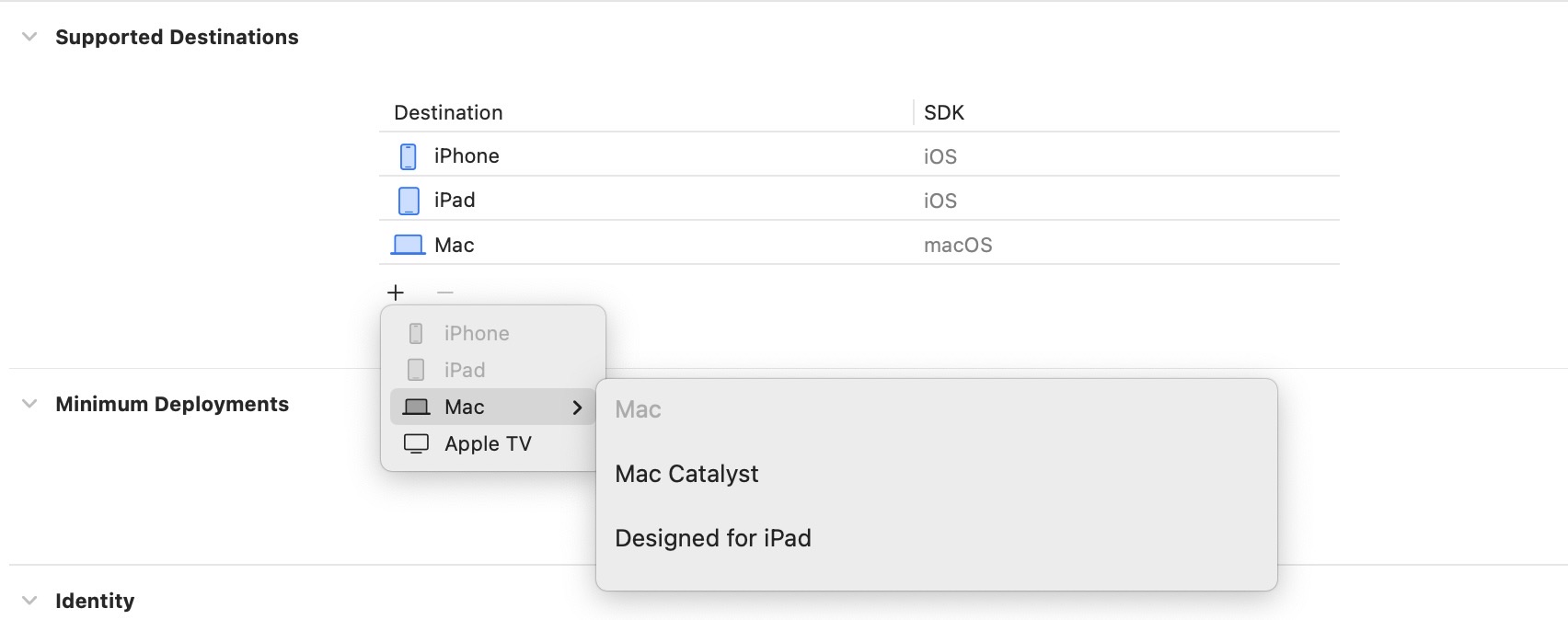
Since the VisionOS SDK will not be released till later, I didn’t expect this to be there, but I was still curious 😛
Looks as if there is no option to add a Vision Pro destination for an Xcode 15 beta project yet …
#Apple #XcodeBeta #WWDC2023
Screenshot showing all the opti…
Looks as if there is no option to add a Vision Pro destination for an Xcode 15 beta project yet …
#Apple #XcodeBeta #WWDC2023
Screenshot showing all the opti…
Fahim Farook
f
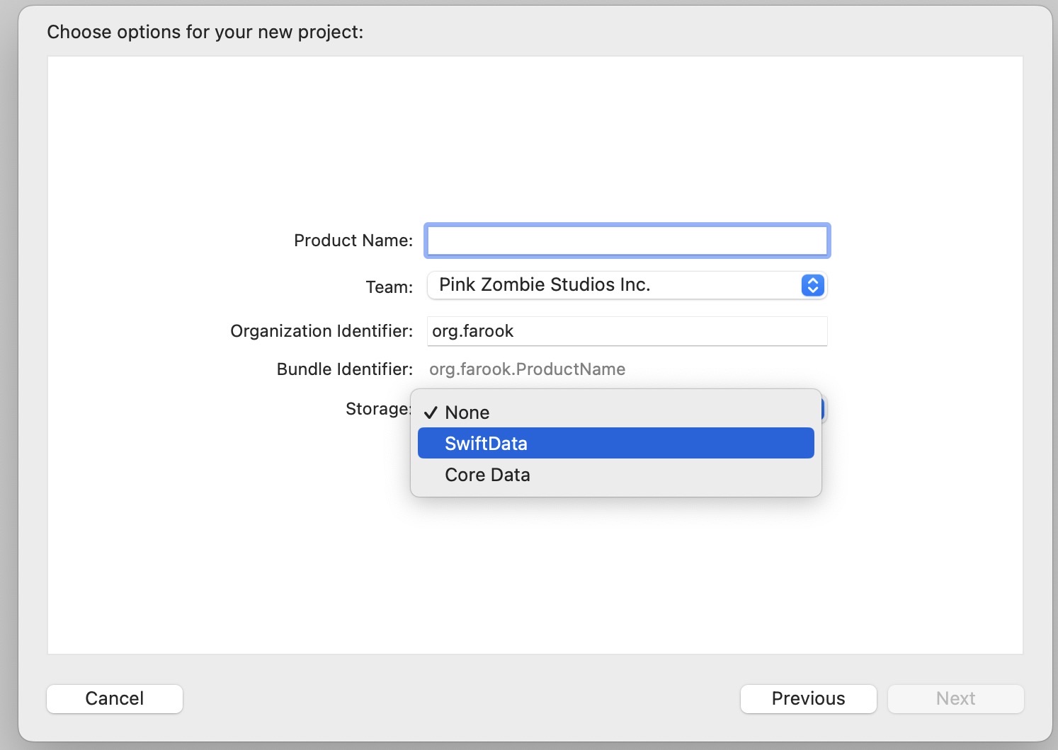
In Xcode 15 beta, when you create a new project, you now can select storage options and can switch between SwiftData and Core Data 🙂
#Apple #WWDC2023 #SwiftData #Beta
New project options dialog in X…
#Apple #WWDC2023 #SwiftData #Beta
New project options dialog in X…
Fahim Farook
f
OK, (hopefully) final note on Xcode 15 beta install issues 😛
This was my experience (see previous posts which might explain this a bit more in detail) — I opted to download both Xcode 15 beta and iOS 17 since the option was presented and I thought you had to select the items you needed. Multiple downloads were started but in my case, I didn’t get the necessary Xcode XIP file.
I eventually figured out how to get the XIP, extracted it and ran it and then it prompts me to download and install the simulators … including the iOS 17 simulator I’d already downloaded.
This was annoying and confusing. Why have the iOS 17 download under Xcode downloads if Xcode prompts you for it again? If you simply wanted to provide the simulators as separate downloads, then wouldn’t it have made better sense not to include this with the Xcode download. Very confusing ….
Since I already had the iOS 17 simulator downloaded, I opted not to download and install the simulator. Instead, I ran Xcode, let it complete the first run and then quit Xcode, opened the iOS beta DMG and copied the files to the relevant location (which was /Library/Developer/CoreSimulator/Profiles/Runtimes) and then restarted Xcode beta.
It detected the simulator and started verifying it but then says that it can’t verify the simulator because it wasn’t signed (or some similar error). But if I go to Settings in Xcode, it now shows the simulator as being present and installed.
I realize that this is a beta, but Apple used to have release notes which explained things but the Xcode 15 beta is just there with no explanations, and no notes. Some info would have eased the process for those who encounter errors?
#Apple #WWDC2023 #XcodeBeta #GettingItWorking
Fahim Farook
f
So … If you (or at least I) try to download Xcode 15 beta and select just iOS 17 beta, I get an xcdownloadmanifest file and the DMG for the iOS 17 simulator. But if I select both the iOS 17 beta and the watchOS 10 beta, then I get the previous items, a download for the watchOS simulator and an Xcode 15 XIP file.
Weird ….
And if I expand the XIP file, it does run on macOS 13.x … So that part appears to be OK. Just not sure why the download itself wouldn’t work for me. Since there are no complaints from others (at least that I could find), I assume it works OK for everybody else. So why me? I have no idea 😛
#Apple #WWDC2023 #XcodeBeta
Fahim Farook
f
If you are on macOS 13.x (Ventura) and tried to download the Xcode 15 beta after WWDC, you might have found that it downloads two files — a 105-byte .xcdownloadmanifest file and a 7+GB DMG named iOS_17_beta_simulator_Runtime … but nothing to show you how to install any of it 😛
I assume the DMG (or maybe the number of DMGs downloaded) will vary depending on whether you selected just iOS or if you opted for watchOS and tvOS too … I just wanted iOS.
Looking at the DMG, I realized that that’s just the iOS simulator part as it says on the tin, but where was Xcode?
The xcdownloadmanifest file is just a text file which indicates that the parent file is Xcode_15_beta.xip and that the iOS file is additional assets. But that didn’t help me much since I had no idea how I could get Xcode_15_beta.xip …
The compatibility info for the download says macOS 13.3 or later, but it doesn’t look as if you can download it at the moment, at least not from macOS 13.x … Maybe later? Or is it macOS 14.x only for the time being?
Guess I’ll keep digging till I find the answer or just get tired/bored? 😀
#Apple #WWDC2023 #Xcode #Betas
Fahim Farook
f
SwiftData … going through the documentation, it looks like it’s all I’d hoped it would be — automatic migration; the ability to define properties as transient, unique etc.; automatic handling of relationships; the ability to store primitive data types as well as complex data types such as structs or enums as long as they conform to Coddle …
The list just goes on …
I just wish that I could use this in production code now 😛
Also, I’m curious as to what format the final data is stored and if it’s possible to view the stored data, especially for debug purposes … I haven’t seen an answer to these two questions yet, but then again, I haven’t really done enough reading/exploration 🙂
I wish I had more brain power to devote to this, but I’ve only had 4 hours of sleep due to staying up to watch the keynote. So I guess I’ll have to wait till I’m more rested ...
#Coding #WWDC #Swift #SwiftData #Apple
Fahim Farook
f
So … I start working on my app which provides multiple timers and Apple finally adds support for multiple timers in the core OS 😛
I also start working on my database engine with CloudKit support for the timer app and Apple announces SwiftData 😀
But seriously, out of all the stuff announced for WWDC so far, SwiftData is what I’m most excited to learn more about …
I’m hoping that it’s going to be a way to add persistence to your apps and also be easy to integrate with CoreData. If that’s the case, I can stop working on my data library and simply switch to SwiftData. Guess we’ll see once I’ve had the chance to do some digging …
#Apple #WWDC #Swift #SwiftData
Fahim Farook
f
Watched the WWDC keynote last night and the Apple AR headset (or Vision Pro) is finally here. But …
My first (and most lasting) impression was one of loneliness.
A father watching videos of his kids, but there’s no family around, he’s all alone.
A woman watching movies on a huge screen but she’s sitting all alone in a darkened room.
Even the woman using the headset and having somebody come by seems to be so isolated from everything.
I’m sure this is not what Apple intended, but that’s the lasting impression I got.
I went in hoping that Apple would show something that people could share. Where people can consume entertainment together and just share in the joy of doing things together. But that didn’t seem to be what they were aiming for — at least, not with this iteration.
Given the price tag, and the barriers to entry, I think I’ll stick with the Meta Quest 3 for the time being. At least, it’s one seventh the price of Vision Pro 😛 Maybe in a couple of years, things will be different?
#Apple #VisionPro #AppleHeadset #Meta #Quest #Impressions
Fahim Farook
 repeated
Adrian Eves
swifteves@mastodon.socialHi. I was a recent casualty of the Disney layoffs. I’m looking to get back on my feet as fast as possible. If you know of anywhere that’s hiring, I’d be very grateful if you could point me in that direction. Thank you!
Fahim Farook
f
And on the other side of the fence (from Meta), Apple seems to have suddenly discovered that gaming exists 😛
“No Man’s Sky” released for Mac yesterday and an announcement of “Stray” coming to the Mac next …
Hmm … anybody think that all this might have something to do with the AR headset and a push towards gaming on it in a major way?
#AR #Apple #Gaming #Announcements
“No Man’s Sky” released for Mac yesterday and an announcement of “Stray” coming to the Mac next …
Hmm … anybody think that all this might have something to do with the AR headset and a push towards gaming on it in a major way?
#AR #Apple #Gaming #Announcements
Fahim Farook
f
So it appears that Meta is taking the as yet un-announced Apple AR headset as serious competition … Announcement of Quest 3 yesterday and a slew of new games for the Quest — and some of them might actually get me to try VR gaming 🙂
I’ve mostly been interested in the work aspect of VR — like having a huge monitor I can code on, but now I might be tempted by “Asgard’s Wrath 2” …
I guess I’ll have to see what Apple has on offer before making a decision? 😛
#AR #Headsets #Meta #Apple #VRGaming
I’ve mostly been interested in the work aspect of VR — like having a huge monitor I can code on, but now I might be tempted by “Asgard’s Wrath 2” …
I guess I’ll have to see what Apple has on offer before making a decision? 😛
#AR #Headsets #Meta #Apple #VRGaming
Fahim Farook
f
I tried to explain the issues I was having with the current SwiftUI navigation options yesterday, but I don’t think I did a good job 🙂 So here’s a second stab at it …
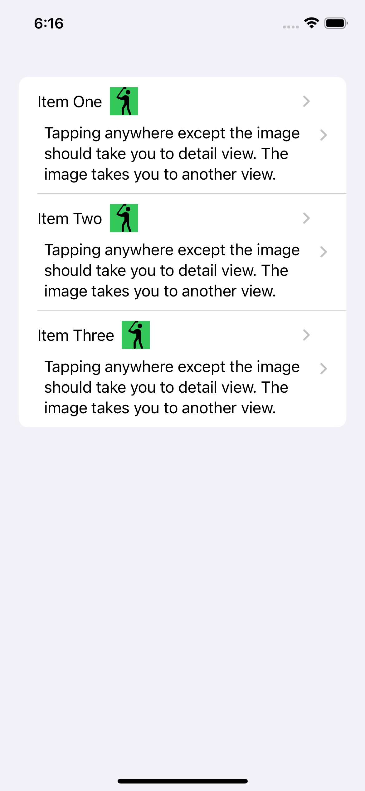
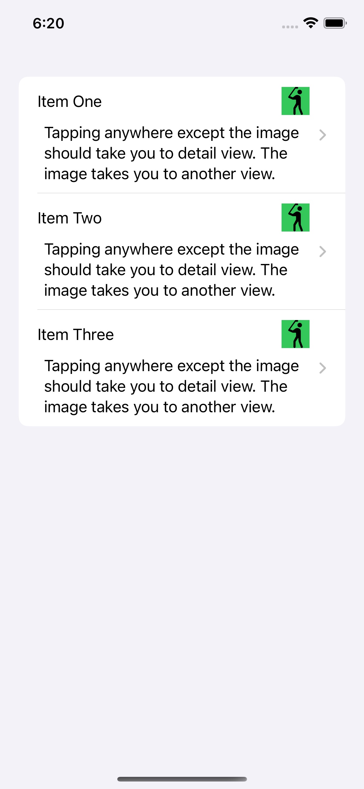
Basically, my understanding is that the only out-of-the-box way to show new views is to either use a NavigationLink or a sheet. I had a List where I wanted the user clicking on the list cell to take them to one view and the user clicking on a button within the list view to take them to another view. (See screenshot #1). This was fairly easy to do in UIKit.
But when I use NavigationLinks for both items, they automatically add these disclosure indicators and doubles them for two NavigationLinks (yes, I know you can hide them with some jugglery, but you shouldn’t need to do that). Worse still, you still get taken to only one view no matter where you click 😛
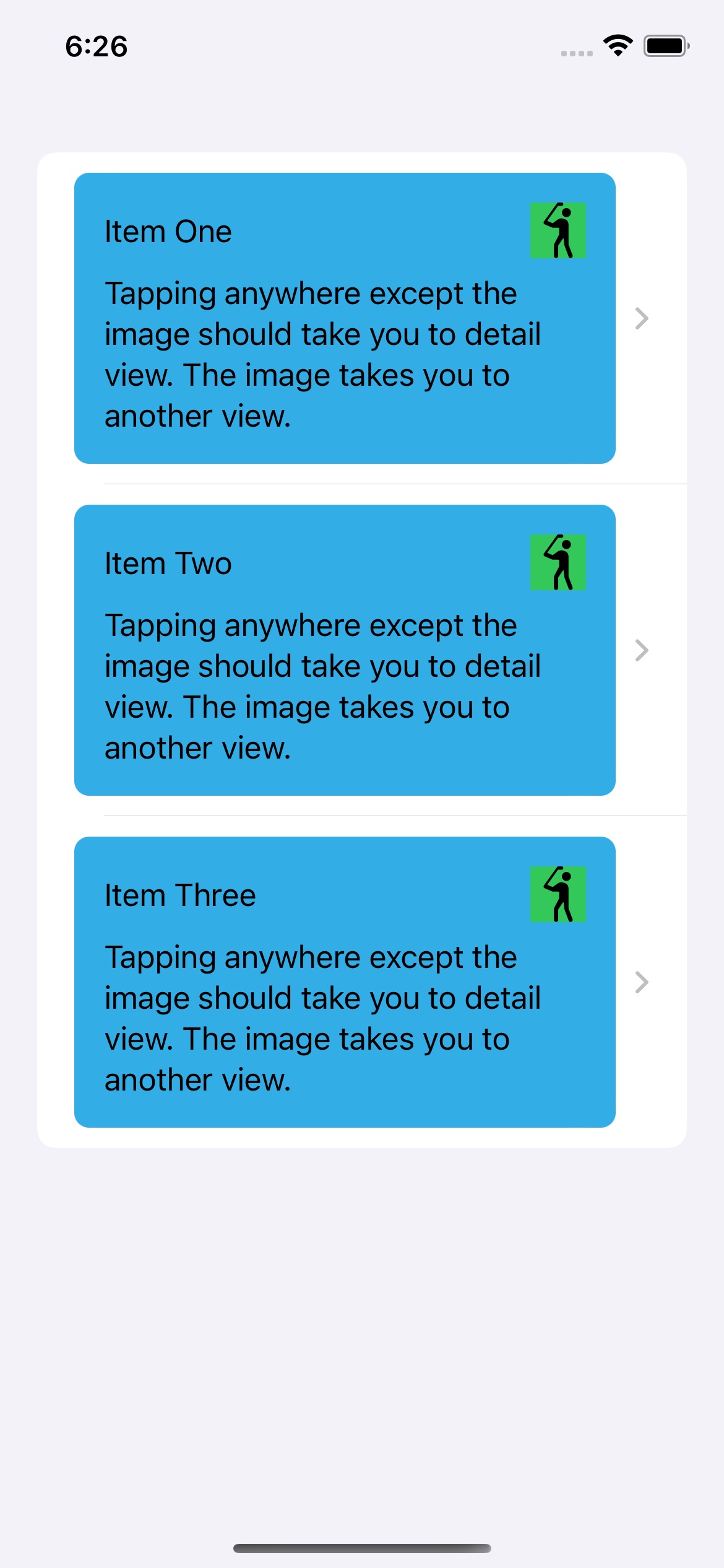
Fine, so two NavigationLinks in the same cell won’t work. So let’s try making one of them (the button) show a sheet instead. That should work, right?
And this does indeed work. (See screenshot #2).
So all is well? Well kinda … First, I shouldn’t need to show a sheet when I don’t want to. If I want to push a new view in, then I should be able to do so, right?
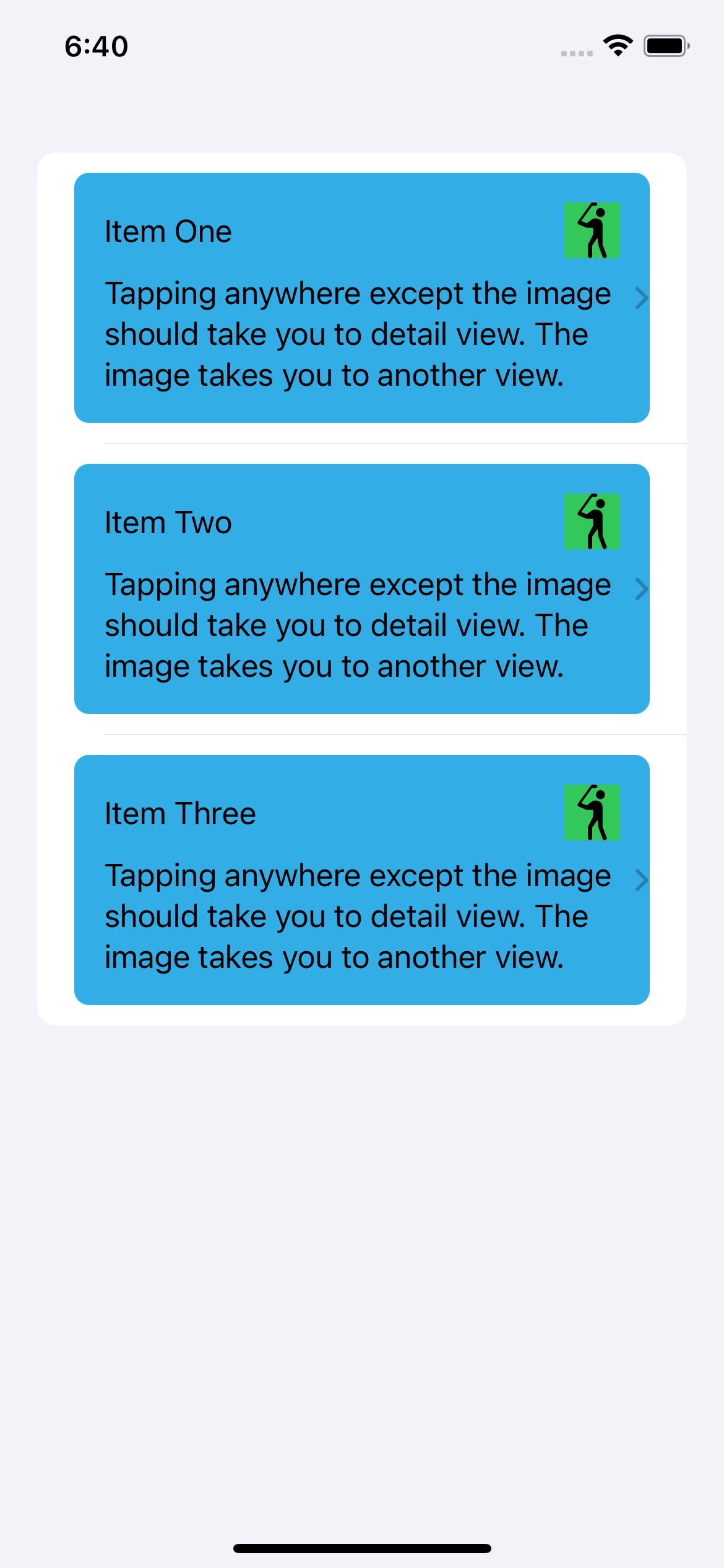
But leaving that quibble aside, let’s say I want my cell to have a distinctive look. Like in screenshot #3. But now I have the disclosure indicator outside my content cell. And that really doesn’t look good to me …
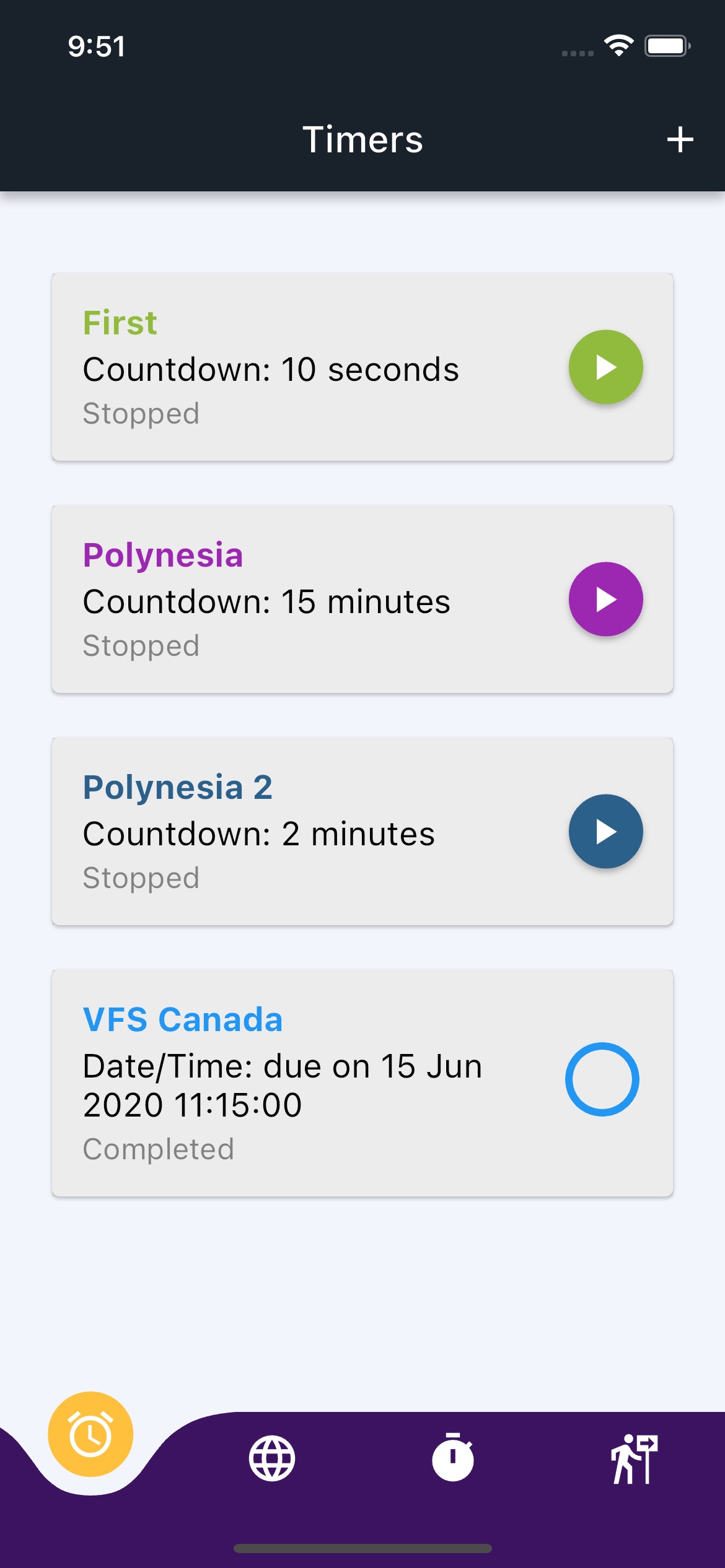
Oh, but you can put the NavigationLink and the cell content in a ZStack to control that, you say? Sure, but then things look like screenshot #4 😛 Sure, with some more tweaking I can probably get things working right but shouldn’t this be easier?
Also, do note that you can set the opacity of the NavigationLink to 0 and hide the disclosure indicator altogether and yet have the NavigationLink work. And that’s what I did in my app, but in that app, setting things up this way wouldn’t work for the two separate views. Tapping on the button would launch both the detail view and the other view.
But it works correctly here. So I think I must have gotten something subtle wrong in the other implementation.
However, if you want to avoid all these hassles, you might want to try out this package:
https://github.com/DoubleSymmetry/XNavigation
It let me do view navigation the way I wanted to, instead of having to use sheets when I didn’t want to use sheets 😛
If you have a better way to do what I was trying to do, please do let me know. I’m always eager to learn 🙂
Disclaimer: I am not affiliated to the developer of the package in any way. I just liked how it made navigation so much easier … at least for the use cases I had.
#iOS #SwiftUI #Coding #Navigation #Apple
Screenshot #1. Trying to use tw…
Screenshot #2. The button/image…
Screenshot #3. Adding a backgro…
Screenshot #4. The disclosure i…
Fahim Farook
f
While I have come to love the latest iteration of SwiftUI for how fast I can get stuff done, one thing that still trips me up is navigation — it’s almost as if Apple expects all screen navigation to happen either as explicit taps on UI elements, or simply modal screens 🙂
With my latest app, I have been hitting navigation limitations pretty hard. I have a list item which also has a button on it which should take you to a different item than tapping on the list item itself. Try as I could (OK, I didn’t try verrry hard 😛) I couldn’t make this work correctly.
Then I found this handy package:
https://github.com/DoubleSymmetry/XNavigation
It made all of my navigation handling issues disappear! (Well, at least for now … I’ve only been using the package for about an hour …) It did make all of the scenarios I encountered (and had to find workarounds for so far) disappear. So I’m very thankful to the author since it makes navigation fun again for me 🙂
#iOS #Coding #SwiftUI #Navigation
Fahim Farook
f
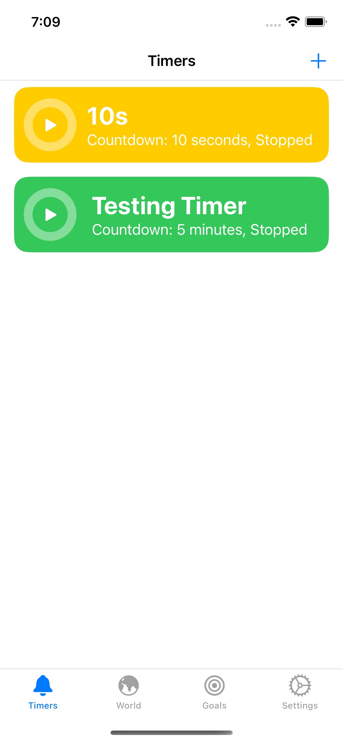
A few years back, I wrote a timer app for my wife since she was tired of how you can’t have more than one iOS timer running at a time. She would want to have two or more timers running at the same time and you just couldn’t do it with the default iOS timer …
At that time, I was heavily into Flutter and so did the app in Flutter so that we could have the timer on either iOS or Android.
After some time, my wife stopped using the app for some reason (we don’t remember why now) and I stopped working on it.
A few days ago, I wanted a recurring timer — one which would fire hourly for say 10 hours during the day and couldn’t find something that worked and wasn’t full of ads 🙂 So I went back to my old timer app.
So much time had passed that the Flutter app took me about a day to get back to working condition. But I kept feeling as if the process was slow … too slow. Just compiling the code to run the app would take a couple of minutes and that just added up. Plus there were other issues.
So I did some scrounging around and found that I had another version of the code — an early attempt to turn the app into a SwiftUI app. It took me only about a day of work and I already have that doing the basic stuff and getting close to feature parity to the Flutter version.
It’s interesting how different languages evolve and change over time and what you thought was the best at one point no longer is …
Screenshots for comparison below.
#Timers #Coding #iOS #Flutter #SwiftUI
Screenshot of an iOS app with m…
Screenshot of an iOS app writte…
